Release Date: June 8th, 1940
Series: Merrie Melodies
Director: Chuck Jones
Story: Rich Hogan
Animation: Bobe Cannon
Musical Direction: Carl Stalling
Starring: Margaret Hill-Talbot (Tom Thumb), Sheppherd Strudwick (Narrator, Father), Marion Darlington (Whistles)

You may view the cartoon here or on HBO Max!
Often regarded as a spiritual successor to Jones’ Old Glory, the comparisons are not for naught. Both films star actor Sheppherd Strudwick as a gentle father figure. Both films feature Bob McKimson’s incredible handiwork as an animator, his lush, tight construction bringing a visceral depth to the characters he animates. Both films also garner many comparisons to Disney through their serious tone and lush art direction. If Old Glory was to have a sister short, this would be it.
However, Tom Thumb in Trouble is more than just “the short that looks like Old Glory.” Perhaps one of Jones’ most Disneyesque films to date, the film expands upon the experience Jones has gathered under his belt in the year that has followed. A keen awareness of staging, composition, flow and rhythm through different shots, how to use certain angles and color for maximum emotional effect, as well as a general understanding of cinematography make for a much more rich and solid product.

Chuck Jones and Rich Hogan place their own spin on the time honored folklore of the boy no bigger than a thumb. The son of a “kindly old woodchopper”, Tom adapts well to his daily life, diminutive size no match for his routine. When a kind bird saves him from drowning in soap suds, a grave misunderstanding ensues when Tom’s father believes that the bird is the cause of Tom’s misfortune.
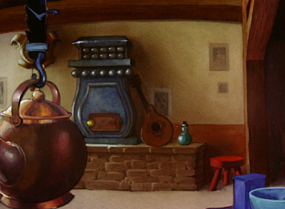
Technical achievements of the short are already flaunted without the aid of animation. An opening shot of the quaint, snow covered country side already cements the cozy-yet-visually-grandiose tone sought by Jones. Colors contrast against each other with striking clarity, but the painting itself maintains a warm richness that presents itself as a greater priority. Atmosphere is the goal of the film first and foremost; if the atmosphere is able to wow the audience as a consequence, then its mission has been achieved.

Strudwick’s opener of “Once upon a time” likewise feeds into such missions for coziness. As he did in Old Glory as Uncle Sam, he presents a calming, velvet timbre that wholly compliments the vibe in question. Conversely, as well crafted as Strudwick’s voice is, his narration is the exact tone that Tex Avery seeks to lampoon in so many of his spot-gag cartoons. Indeed, just from the first five seconds of the short alone, the audience understands that wacky animal hijinks aren’t a major goal of the film. A wry refutation of the opening’s coy (yet genuine) coziness isn’t in the cards.

Warm, cozy backgrounds are a continued priority as Strudwick establishes the story: kindly old woodchopper loves his incredibly tiny son, whom he called Tom Thumb. Faux multi-plane camera pan effects are concentrated within the establishing interior shot of the cottage to uphold its status as a Disney imitation. Of course, the cartoon is more than just an effect of Walter Elias Disney, but certainly does read as one of Jones’ most deliberately Disneyesque films to date. Not an insult so much it is an observation—and, really, fact.


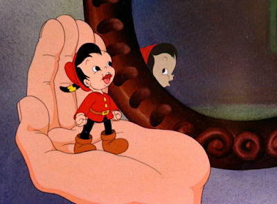
Sniffles Takes a Trip proves to have prepared Jones well for this cartoon. Similar to Trip, Tom Thumb in Trouble evokes engagement and pathos through a sympathetically warped sense of scale all throughout the cartoon. Tom’s father looks like a giant next to Tom, the pillow they lie on seeming cavernous. Rather, it’s Tom who is the minuscule outlier. The filmmaking makes a point to take a more sympathetic and immersive angle in an attempt to get the audience to experience Tom’s life vicariously through his point of view. Which, in turn, seeks to make him all the more likable.


Parallels are rife between the positions of Tom and his father, both facing the same direction so as to further enunciate the contrast between their sizes. Thus, the novelty of Tom’s diminutiveness is heightened through a side by side example of what is “normal” and what isn’t. Rather than talking down Tom for being so tiny, however, or stressing how much of a misfit he is through his small size, the overarching tone of the short seeks to take sympathy and presents his small size as a mere fact of life rather than a vice. Something to be awed by rather than made fun of—especially seeing as so much of the filmmaking makes a point to experience the cartoon through his point of view.
Jones’ Disney shorts are often dismissed as being “humorless” by critics today, and this short is often lumped in with such complaints. Admittedly, Old Glory is really the only cartoon that falls into such a category. The issue isn’t so much a deliberate lack of jokes in the writing—rather, it’s that their novelty has been long obsolete. A sequence dedicated to Tom struggling with an obnoxious, anthropomorphic-by-coincidence alarm clock tries hard to get laughs from the audience through its timing and cutesy antics; Tom’s self satisfaction at shutting the alarm off is interrupted by it switching back on again, he’s so small that he ends up dangling from the alarm’s bell, etcetera, etcetera.


Like the bulk of Jones’ earliest filmography, such antics are better categorized as cute rather than funny. At the very least, little about the sequence reads as funny today. Still, there is an effort made to be lighthearted and charming in its tone that is certainly absent in the short’s more stolid counterpart, Old Glory. Stalling’s chipper music score playing only in tandem with the shrill ring of the alarm clock, going mute to heighten the few seconds of relief given before resuming once more makes the start and stop nature of the gag much more rhythmic and effective in its contrasts between loud and quiet. Tom likewise succeeds in his mission of being drawn to look cute, but little else. Inking errors on the clock face as it winds up to ring for the first time are casually noted as well.


Where Bob McKimson wiped the floor of Old Glory with his animation of Uncle Sam, he does the same here with the animation of Tom’s father. While doses of uncanniness persist (namely by design, as he is meant to appear as a giant against his son), awkwardness in discrepancy between designs isn’t nearly as prevalent as it was in Old Glory. Tom being the same species as his father helps in that regard, as well as not being a well established character like Porky. Suspension of disbelief is easier to accomplish, and McKimson’s animated intricacies through head tilts, meticulous angles, and a believable knack for weight and acting are somewhat easier to appreciate.


Margaret Hill-Talbot assumes the role of Tom, essentially just using her Sniffles voice. While it certainly meets the quota of cute, her tone does veer on the cloying side more often than not in a way that doesn’t necessarily preside with her performances as Sniffles. Story, tone, and again, the character’s lack of association with the audience could all be contributing factors. Nevertheless, her vocals yet again strike the warm tone sought by Jones—Tom and his father bidding each other a mutual, cheery good morning likewise uphold such values.

With the two main characters awake and the exposition established by the narrator, Jones’ next mission is endearing the characters to their audience. And what better way to accomplish that by demonstrating their morning routine? The accommodations made for Tom’s size are coyly displayed through a series of seemingly menial tasks made endearing through their innovations. Like the majority of the short, attempts at humor are sorely weakened as the years have gone on (and were admittedly weak even in comparison to the humor exercised by the other Warner directors at the same time), but the cutesy business does firmly establish the theme of Tom small, environments big, accommodations endearing.
Accommodations such as his father cupping water in his hands for Tom to swim in as a substitute for a bath. Inconsistencies in underwear aside (Tom flashes his naked rear in the first scene of his running to silence the alarm—following the pre-Hays code era of cartoons where exposed butts were a common synonym for intended cuteness—but is covered here), the animation and staging is certainly impressive. Tom climbing on his father and utilizing his finger as a diving board continue to provide a warped sense of scale that translates to a profound mysticism and fascination for seemingly menial environments. Likewise, semi-transparency on the water effects bestow an added believability that melds well with the realistic construction so prevalent on the father.


Bobe Cannon’s animation is easily identifiable in the scene of Tom getting dressed—particularly thanks to the prominent buck teeth when he talks (“Gee pop, I feel like a new man!”), though the lips visible on his side profile and tapered mouth shapes are easily comparable to his work under the Clampett unit as well. Cannon would remain in Jones’ unit throughout much of the ‘40s, a cornerstone in establishing and maintaining the loose, almost blobular (if his smears in The Dover Boys at Pimento University are anything to go by) art direction found within the unit through the early to mid ‘40s.

His Clampettisms are still very visible here, but nevertheless serve as another testament to just how recognizable his style could be—regardless of how that style manifested itself at the time.

Similar observations apply to Bob McKimson’s skill as an animator; the believability of his weight and construction shine in the following scene of Tom and his father having breakfast. Polite uncanniness still persists in just how sculpted the father looks against his son, but serves as a compliment just the same; having one’s animation seem too realistic in appearance is arguably better than the inverse.

Jones continues to enforce endearing parallels between father and son. Where the father takes a swig of coffee and remarks “Man, that’s good,” Tom follows his footsteps with a swig from thimble (liquid contained to the thimble in spite of its many holes—dedicating a sequence to Tom struggling to stop the coffee from spilling out of each hole is not a tonal priority), his remark being the comparatively juvenile “Boy, that’s good!” Role as man and boy respectively are coyly noted through the verbiage, supporting what the viewer already gathers from viewing their respective morning routines.


With that out of the way, the story slowly—that’s the keyword—moves along as the father excuses himself to head off to work, asking if Tom can handle dish cleanup. Strategic camera placement seeks to warmly heighten Tom’s size disparity. In this case, the down shot not only makes him seem minuscule, but the comparatively large spoon and salt shakers also provide their own commentary: how on earth is tiny Tom going to be able to clean them up with no help if he can barely pacify an alarm clock? The visual aid they provide by framing Tom and guiding the viewer’s eye to him serves as an additional bonus.


Momentum and pacing between beats stumbles briefly upon the father’s exit. Admittedly, it’s a logical choice—after we cut from Tom, we already find the father dressed up and closing the door behind him. Pacing has been glacial enough as is; out of admitted necessity, as introducing and warming the characters up to the audience is needed so as to make any inevitable conflict land more effectively, but dedicating a laborious sequence to the father bundling up for the cold would only slow things down further. Regardless, the immediate cut to him in a different outfit and in a different part of the room is jarring—especially when Tom is waving in the opposite way he’s facing.


Nevertheless, cutesy song numbers take priority, again cementing comparisons to Disney and company. However, in spite of all of its cloying saccharinity, comparisons are more justifiable to neighboring Chuck Jones cartoons; as he cleans the dishes with a whimsicality reminiscent of the earliest Warner cartoons through its innovative transformations (using a broom to scrub soap chips on a plate, cleaning a glass like a window on a skyscraper, general accommodations such as those often found in earlier films), he sings “In a Little Dutch Kindergarten” with contextually appropriate lyrics.


Margaret Hill-Talbot would sing “In a Little Dutch Kindergarten” in the same key in another Jones directed cartoon; in this case, Sniffles supplies the melody in The Brave Little Bat a year later. Sniffles’ song is much shorter and to the point, serving more as a character piece and means of introduction rather than an entire segment. Like most of these shorts, there isn’t any particular right or wrong approach—the abbreviation of Sniffles’ performance is welcomed, but Tom’s number scratches the appropriate itch for cuteness.

Disney comparisons are particularly anchored in the contribution of a whistle solo from a bird outside the window, whistles provided by Marion Darlington. It’s cloying, especially as the years have gone on in hindsight, but again suits Jones’ particular need for this film. Likewise, the diagonal angle introduces an eye-catching dynamism to elevate the visual interest of the scene. Same for the window panes providing a clear frame around the bird.

Charm in Talbot’s vocals is probably the biggest source of attraction for the song—not much else is going for the number outside of cuteness. Background paintings are pretty, inspired bursts of staging such as the scenes with the bird are appreciated, but the cleaning gags are far from gut bustingly riotous.


Incidentally, comedic politeness extends to the finale of the song as well. The end of the number is marked through Tom’s diving off of a teapot, where he lands on a fork that propels a teacup onto its respective place on the shelf. Motion is somewhat glacial, drybrushing on Tom and the fork seeming to clutter the scene more than accentuate the speed, but the whimsicality of the gag—and the song as a whole—is harmless.


Glacialness is likewise present in an awkward shot of Tom bobbing his head. Meant to convey his satisfaction at a job well done, momentum is further slowed and takes what little steam is present in the sequence. His strutting off-screen falls into similar vices…

…until a spare bar of soap answers the call for action.

Even then, Tom sliding off the counter, shanghaied by the bar of soap is glacial and weakens some of the action’s impact. Thankfully, that there is a shift towards any action at all somewhat lessens the blow of the slow timing, but the introduction of a climax isn’t as visceral as it could or should be.


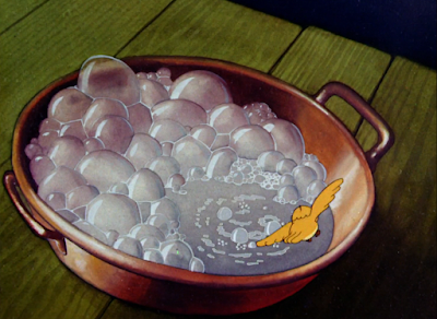
Such is a recurring theme. The conflict that follows seems juvenile in comparison to the conflict and humor touted by the other Warner directors (and really, Jones himself)—Tom struggles to tread water in a pan full of soap suds.

Timing of his flailing—and flailing at all—are thankfully more urgent than the awkward, molasses movement substituting his flailing when riding on the soap bar. Likewise, a dramatic down angle of the soap pan makes it seem all the more large and imposing, the distance between the shelf and table in which the pan rests exaggerated to be even more staggering. Regardless, the punch needed for the conflict to land never really comes. Perhaps that’s due in part to the length of his drowning, nearly taking 15 seconds to garner any sort of outside reaction.


Said outside reaction is delegated to Tom’s bird friend from earlier, whose appearance asserts his function outside of clinching the Disney comparisons in the song number. Frames carved by the window panes and that same diagonal up shot of the window introduce a visual interest more enriching than what is present for Tom’s histrionics. Likewise, the continuity of the repeated staging introduces an informal, recognizable pattern, enabling a flow to a film who needs the aid of such.


Nevertheless, the bird’s rescue of Tom is another victim of pregnant pacing. Here, it seems somewhat deliberate—the bird winds up to break into the window, only to turn around, appearing dejected. Jones seeks to trick the audience into thinking that the bird has given up…


…only for him to wind up with twice as much ferocity and actually break through.


It is an effective tactic, introducing a sly subversion that is welcomed in a rather straightforward film elsewhere, but the timing takes twice the amount of time and causes the impact of the joke to deflate severely. Regardless, the thought is clearly conveyed, the drybrushing on the birds wings as he flies compliments the drawings and actions nicely, and the blinding flash of light from the impact lines as the glass shatters makes the collision seem all the more sharp and piercing.


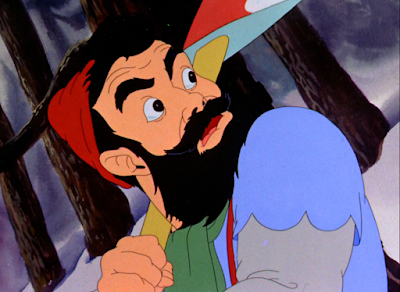
In spite of the pacing issues scattered throughout the film, the conscientiousness of the staging benefits the drama and heart in spades. Specifically a shot of Tom’s father in the woods; what seems like an inoffensive yet inventive staging choice, having the shot angled diagonally and closed in on his face, is actually meant to evoke unease and action through its “unfamiliar” positioning. The diagonal angle indicates motion and dynamism, something not necessary for a close-up of some innocuous action. Attention is demanded here.

Similar philosophies apply to the father’s eyes widening. Throughout the cartoon, his eyes mainly default to a squint—it indicates warmth, jolliness, comfort, as though his eyes are always pinched from the permanent grin on his face. That they seem to bulge out of his face indicate a dramatic shift in demeanor. Like the connotations wrought from the tilted staging, the change in expression indicates unease and tension.
Jones deliberately jolts the audience with a jump cut back to the bird flying in the house—while it sounds disorienting on paper, a lack of smooth transitions, the harshness of such a segue is padded through similar staging. A down shot of the soap pan is at a slant similar to the one in the prior scene, allowing the transition to move more smoothly thanks to the synonymous patterns. In spite of this, the deliberate jolt through the use of a jump cut is preserved, evoking a sense of action through such “quick” cutting.
Indeed, cutting makes up the next series of scenes to indicate a rising climax in tension. The feet of the father approaching the house and the bird dragging a waterlogged Tom put of the soap pan are subject to repeated camera splices—one shot of the father to one shot of the bird, back to the father, back to the bird, etcetera, etcetera.


Timing of the animation suffers in parts; namely on the father. Effective as his appearance is, footsteps quickening with each consecutive cut, the animation seems too even and glacial, the second shot of his running in particular losing any sense of necessary urgency. Regardless, as is yet again the theme of the film, the general idea is there. Frank Tashlin was a master at cutting between scenes to create a crescendo of action and speed—some of the critiques here about Jones’ lack of speed admittedly stem from a subconscious bias knowing what other directors were capable of at the same time. The tone and message and urgency of the story here are very easy to digest and process—they could just shine even stronger had they been executed a little differently.
Coincidentally, two shots that don’t boast any animation at all are some of the most effective in the entire cartoon. Draftsmanship on the second shot buckles beneath the weight of the first one—the bird’s wide eyed expression looks somewhat dopey and awkward next to the genuinely paralysis inducing stare of the father—but the repeated cutting, the motions of both characters, the momentum wrought by the filmmaking all coming to a crashing, stuffy halt is incredibly effective.


Same with the father’s face turning into a grimace as he marches towards the camera. Glacial movement persists, somewhat easing the dramatics, but his outrage is palpable and fearful knowing just how nice and warm he was before. 4 minutes of exposition between Tom and his father could get trying, absolutely, but it was instrumental in ensuring the shift in narrative tone and emotion was as raw and visceral as it is.


An onslaught of dynamic camera angles and staging choices maintain the strained emotion—criticisms of strained pacing still apply, but the close ups and diagonal angles accompanying the disembodied, burly hand of the father smacking at the bird make up for it in theatrics. Philosophies of the diagonal angles ensuring dynamism still persist, and a sense of unknown at the obscuring of the father’s face successfully instill a sense of unease. It may not be the most breathtaking climax ever put on screen, but it certainly suffices.


A shot of the father reaching into the foreground and essentially grabbing at the camera is particularly striking through its depth. It feels as though the father is going to leap out of the screen and grab the audience; slanted angles in the staging allow the perspective to feel natural and flowing. Had the father reached straight towards the camera head on in the same manner of his approaching the bird in the home, it may suffer from feeling stiff or unnatural. Such is not the case.


A fade to black marks a shift in tone, which is cemented by the arrival of Tom on screen. He’s thankfully okay, visible, somewhat labored breathing indicating his consciousness. A warmly juvenile accompaniment of “The Little Dutch Kindergarten” tinkles in the background as a reprise to garner pathos through its recognizability and Tom’s prior song. Likewise with the soft tones of Strudwick’s voice as the father, lamenting his choice to leave Tom alone and asking about “that bad ol’ bird”— “You’re so little and helpless.”


Glacial pacing makes itself at home, but, in this case, the lugubriousness is warranted. The father’s gestures as he tucks Tom into bed feel exceedingly tactile in their gentleness, and Strudwick’s voice is a perfect match for the pitying, reassuring warmth Jones was seeking. It makes Talbot’s whines of “But daaaad…” stand out in comparison, teetering on annoying. She still has plenty of sincerity in her own lines, but, as was mentioned earlier, the voice direction is a little too cloying in comparison to other films she’s starred in.


An awkward shot of the father leaving Tom succeeds in its intent—the turned back in particular indicates there is no further room for argument, and Tom is going to sleep whether he likes it or not—but feels somewhat rigid in conjunction with the bordering scenes. Similar to the father’s initial exit to work, the problem likely could have been solved by casting a shadow representing his presence over Tom, the shadow shrinking to indicate his leave. Regardless, the overall intent of the gesture is clear.


Time marches on, courtesy of a few still shots indicating so with the clock. Rather than depicting the arms of the clock making their circuitous rounds, Jones merely indicates the transition through a fade to black and a new time.


Whereas the two different times on the clock are a parallel in and of itself, a stronger parallel is on the bed; the pan of Tom’s father in bed and Tom himself is faithfully reused from the beginning. However, there’s a catch that wasn’t present before: Tom’s spot is empty, as indicated by the indent in the pillow and the unoccupied blanket.

Very solid storytelling that doesn’t require any additional commentary from the narrator to get the point across. Jones’ early films have a tendency to be vague in their delivery or writing—some jokes don’t land or details feel glossed over. It’s an issue he’s been remedying as time has gone on, and here, the intent of nearly every scene feels clear and concise.

Intent is also clear and concise when cutting to Tom writing a goodbye letter, hugging a pencil to scrawl the words on paper. We cut to him finishing his signature (which a keen eye reveals his name already very lightly indicated on the letter, ensuring the animation is all the more smooth and directed), which is enough to indicate the overall message of his purpose but doesn’t drag the point into the ground by showing him starting the letter to begin with.


Instead, a down shot allows the audience’s prying eyes to take a peek at his note. Unable to verbally argue with his father, he instead puts his concerns about the bird into paper, promising to look for him and that he meant no harm.

Throughout the cartoon, Jones takes carefully crafted shortcuts through his transitions. Rather than depicting Tom jumping from the table, opening the door, and trekking out into the cold, the same is indicated through a mere cross dissolve to his pre-determined exit. It’s a cheat, yes, but an economical one—the sculpted animation of the father and presiding production values overall don’t give the impression that this film was cheap to make. The shortcuts aren’t obvious in their handiness—illustrating the same general idea as the alternative hypotheticals above—but appreciated and understood when caught by discerning eyes. They don’t detract from the overall story nor look of the film.

On the topic of the cartoon’s appearance, the art direction prepares to meet its lush zenith through more carefully crafted background shots. Discrepancy in value and color temperature clearly indicate the difference between warm and cold, safety and danger. On the shot of the snowscape where the light of the house is reflected onto the snow, it’s more obvious, but even persists through the shots of the open door. The brown hues of wood in the house possesses a much more rich warm than the empty cold outside.

Another parallel strikes when a draft prompts the door to slam shut; the father awakens from the noise, but doesn’t think much of it… until he spots the note pinned into the pillow. His eyes bulging in surprise provides an answer to his reaction of the bird flying into the house, and the pan to the note follows the rhythm orchestrated by the prior scenes of the father and Tom in bed (or not, as the previous sequence demonstrated.)


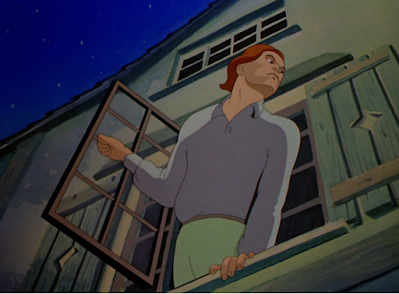
In a (somewhat unintentional) sense, parallels even extend to different cartoons—the animation of Tom’s father looking out the window and yelling for Tom is slyly recycled from Old Glory. The animation looks better here than it does the former, construction more solid and appealing, and the reuse doesn’t detract from the story or pathos. Especially with similar dynamic shots occupying so much of the film, its inclusion fits snugly and innocuously.

Jones adopts his experience from Sniffles Takes a Trip and filters it into the following montage of Tom’s father calling into the night for his missing son. Admittedly, parts of the montage feel uncanny—particularly the close shots of the father’s face, a combination due to awkward, rigid motion and purposeful unease from his wide eyed, shadowed face—but that is precisely the point. Sounds of the wind shipping, the snow fall creating a potential death trap to blanket Tom, the vast emptiness of the dark forest showing no signs of human nor animal life are all meant to evoke the very opposite of all that is comfortable and warm. Strudwick’s final shrieks of “OH TOOOOOOM! TOOOOOOM!” are wholly convincing in their grief.


It isn’t Tom who answers his father’s cries, but the little bird, nesting in a tree. Seeing as he is introduced only with his glowing eyes, the audience is momentarily deceived into thinking it’s Tom who has found a safe shelter. That is not the case.


Regardless, he isn’t far off; after the bird takes off, the camera answers with a shot of Tom struggling to trek in the cold. His puniness and vulnerability is commented upon by the composition; rather than focusing the camera at his eye level, everything made to seem huge from his point of view, the camera instead looks down upon him to make him feel tiny, isolated, and overwhelmed by his surroundings.

Backgrounds are reduced to mere color cards of black with the scenes of the bird flying in the snow. That way, the audience is meant to focus on the bird and the bird alone, undeterred by any coincidentally distracting background paintings. However, the true intent of the color card is to disorient the audience and throw off their sense of direction. Emptiness of the forest feels all encompassing, the bird seeming to fly into true danger without any sort of guidance from the trees in the background.

Such is the case when the bird scoops Tom onto his back. Following an impressive perspective shot of the bird flying beneath Tom at a distance, curving and soaring towards the audience as he shifts direction, the background is an inky black cavern once more. Here, it seems to be more of a cost cutting measure and a reply to the aforementioned scene; a visible background pan would have been more effective, demonstrating that the two are fleeing out of danger and into safety.


However, the short’s budget must be taken into account—if there wasn’t a background pan ready for them, then it probably wouldn’t do much good to stitch one together for just a few seconds if it isn’t even the visual priority of the scene. Instead, the sequence works as a response to its predecessor, but the disorienting effect of the color card comes in particularly strong. With the direction of the snow and wind, it almost looks as though the bird is flying backwards.

Back to Tom’s father, who is grief stricken. Stalling’s whiny violin score of "Brahm’s Lullaby" seems somewhat ill-fitting and disingenuous; one doesn’t tend to associate the number with somberness, as is the case here. Regardless, it is fitting in that it meets the bare minimum of sounding sad, especially with the moans of the father and his sallow expression as he picks his head up.


It also provides a jumping off point so that the tinkly, jolly sting of “In a Little Dutch Kindergarten” can shine in its plucky glory. A camera pan reacquaints Tom with his father, Tom giving a cheery “Hi, pop!” that again doesn’t seem to match the heart as well as it could, but suffices nonetheless.


Likewise with the reaction of Tom’s father. His shedding a tear feels genuine, the familiar expression of warmth making its way back on his face once again, but the bell chiming sound effect as it drops onto his arm renders the action a bit more juvenile than what’s intended. Thankfully, some of the effect gets muddled through a cross dissolve, though the sound effect is still very audible.

With that, we approach one final shot of Tom asleep on the pillow, just as he was in the opening…

…and the father welcomes his new company as well.

Jones has quite a few Disney imitations under his belt. The first 3-4 years of his entire filmography are often lumped under the category of the Disney influence years—some shorts certainly support that notion than others. Regardless, Tom Thumb in Trouble is one of his most Disneyesque cartoons to date. That is said with admiration rather than disgust—at that time, Disney was synonymous with quality, and in spite of its weaknesses, this is a short worthy of being compared to Disney quality.
There is a certain irony in knowing that even Disney wasn’t churning out these cute-but-climactic epics at the time; his short form subjects were adopting a more whimsical tone in humor, whereas the theatrics were reserved more for the features. Even then, this is an effective homage to what Jones was admiring and seeking to imitate. The art direction is consistently gorgeous—again, there are doses of uncanniness, but not nearly as concentrated as what is in Old Glory—and the story has heart, even if it’s a little tooth rotting and/or slow in the process.

Admittedly, this is a short that would almost fare better if it were released under Disney’s name. Not because of the quality or product, but the environment; as preciously mentioned, even Walt Disney wasn’t interested in the market Jones is trying to hit with this film. At least, not outside of feature length projects. There’s also the continuing issue of Warner’s priorities and cartoons released by the other directors—this sort of tone isn’t what Leon Schlesinger was necessarily aspiring for anymore. Gone are the days of gunning to “make ‘em cute”, as are the days of riding on Disney’s coattails. Irreverence is growing more native to the Warner style, and the ever eclipsing arrival of a certain wabbit would make that change permanent. Films like these pale and suffer in comparison—not because they’re bad, but just a general lack of and conflict of interest.
If anything, it’s earned a unique name for itself by being so serious and cinematographic in an age of raunchy spot gag cartoons or increasing embrace of meta humor. Even regardless of one’s personal interest in these types of films, one has to praise Jones for sticking to his guns for as long as he did. He didn’t make one cartoon in the vain of Disney, see that it wasn’t received well, and stop right there. Maybe the identity and artistry of his films would have progressed faster if he did—perhaps that bright period in 1942 where he began to embrace the Warner brand of humor and make it his own would have instead been known as the bright period of 1939 or bright period of 1940. Either way, he stuck to what he liked, always seeking to build upon the artistry of his films but ensuring he stayed with what was comfortable. It’s easy to rag on him for being “behind the times”, but it’s just as admirable and inspiring as it is an impediment.


