Release Date: December 21st, 1940
Series: Merrie Melodies
Director: Friz Freleng
Story: Dave Monahan
Animation: Cal Dalton
Musical Direction: Carl Stalling
Starring: Bill Thompson (W.C. Fieldmouse, Mohican), Mel Blanc (Blabbermouse, Dumb Mouse, Last Mohican, Whistler’s Mother, The Thinker), Georgia Stark (Whistling)


(You may view the cartoon here!)
Released in theaters the same day as The Timid Toreador, 1940 finally draws to a close through the courtesy of Shop, Look, and Listen. It almost seems fitting that the last short of the year is a “sequel” to an effort only months before—it, in a backhanded way, demonstrates the rapid growth underwent by these cartoons just in the span of 12 months. The ability to find a short so formative that it immediately demands a follow-up in the same year. There is something to be said about such progress.
Likewise, there is something to be said about the rapid turnaround time of the cartoon. Shop isn’t so much a sequel to Little Blabbermouse as it is the metaphorical leftovers shoved in the back of the fridge; a very liberal chunk of the cartoon reuses scenes and animation directly from the former. Long pans and static shots wedge themselves in between the reuse and what little fresh content there is. Fresh content that isn’t so fresh after all—a few of the new gags sprinkled in are recycled from previous, unrelated cartoons.
Listing out all of the short’s flaws in the very beginning seems needlessly critical—normally, shortcomings would be expressed and summarized towards the end after there has been time to draft more opinions. Regardless, the flimsiness of the cartoon is inescapable. It does affect the way we view and interact with the short from a critical, analytical standpoint.
As such, some portions of the review may seem more brusque than others; I encourage those unacquainted with the short’s predecessor to read the accompanying review first (or, at the very least, watch the cartoon) so more time can be delegated to analyzing the new.
Here, the plot is the same as the last; amidst a tour of the store’s various sentient goods, Blabbermouse annoys his W.C. Fields caricature of a tour guide—and the audience—to no end.
Thankfully, one unequivocal strength of the cartoon is its music. Stalling’s lush orchestrations of “Now I Lay Me Down to Dream” inflate the opening minute of still shots, pans, and truck-ins—the richness of the music is almost deceptive, disguising the lack of substance in visuals and gags.
Our first barrage of gags pertain to some appropriate wordplay; “Gimbels” is now appropriated as “J.T. Gimlet”, the J.T. a likely nod to Jack “J.L.” Leonard Warner. Perspective on the neon sign in conjunction with the building is somewhat off, creating a somewhat distorted dissonance in the layout, but the effort is appreciated. Such brazen, neon lights (which Freleng would use as a topic for a light themed spot gag cartoon in 1942, Lights Fantastic) convincingly insert an air of importance and compliment the staggering height of the building.


Freleng does attempt to squeeze some of his own tone into what he is given; it doesn’t necessarily save the gags from their terminal corniness, but he’s able to trick the audience into believing they’re mildly funny through sharp timing in his camera movements. A close-up of the store’s hours exhibits this quite well; the rule of comedic threes subliminally prepares the audience for a punchline, and while the punchline of “if we were open Sundays” isn’t necessarily riotous, the rather wry pan down to the addendum gets a polite laugh through its brusqueness.


A comparable sequence would be Miles Standish returning to ogle at the pinup on his calendar in The Hardship of Miles Standish; that same sardonic camera movement is employed here in an attempt to garner the same laughs. It is a rather effective maneuver through its consciousness. Freleng’s understated, ironic sense of humor doesn’t have much room to flourish in this cartoon—as was the case with Little Blabbermouse—so the little opportunities that do enable him to speak up are all the more noticeable.
A pan of the department store’s interior is effectively atmospheric in its vacancy. Between Stalling’s music score growing muted, the hazy lighting (that could also be a product of poor print quality), and the barren shelves and objects draped in sheets, it truly does convey a genuine stillness that is as cozy as it is unnerving. Little Blabbermouse’s opening tapped into the same appeal right away; there is a benefit wrought here with the quietude juxtaposing against the neon signs and giant buildings in the nightscape.

W.C. Fieldmouse serves as our first indication of some animation in the film. Here, he displays some inquisitive trepidation, sparing some well timed head tilts left and right to ensure that the store is free of any stragglers. A much bigger contrast than what was touted through his playful, triumphant carnival barking in the short’s predecessor—his cautiousness allows the sleepiness of the atmosphere to linger just a few moments longer before segueing into the gags that await.

That all happens off screen. Same underscore of “Concert in the Park”, same advertisement of a sightseeing tour. While it could be argued that obscuring his barking to an unseen crowd supports an air of “mystery” that ties into the ambience of the deserted department store (that it indeed has occupants is meant to be a twist), it is, namely, a maneuver to save time and money.

Such is confirmed through the direct reuse of the perspective shot from Blabbermouse. A lack of hook-ups somewhat makes it jarring, as it is a direct jump cut—some of that seems to stem from the same music score overlaid on top of the scene. It feels as though there should be a sort of break in between, or at least some signifier in the music that accompanies the action on screen. No such luck. Even audiences without the luxury of seeing the short’s predecessor may have picked up on the suddenness of the jolt.


Fieldmouse advertising the tour as “new” and “different” is accidentally hilarious knowing that the only difference in animation between this and the same scene in Blabbermouse is the background; the delivery itself is somewhat unconvincing, but such is the plight of hindsight bias.


Likewise, more recycling prompts accidental inconsistencies—Fieldmouse’s scowl in the prior short is a hook-up to his disgruntled muttering at Blabbermouse’s embrace of his namesake. Here, the same disgruntled hook-up is in effect, creating a bit of a jolt against the neutrality of his expression in the preceding scene. It isn’t exceedingly obvious, but there is a very slight beat that lingers to allow his reactions to breathe in the context of the former—here, it just adds further inconsistency.

In any case, the audience is finally met with some fresh material as focus is shed on the shoe department. Limiting the gags to mere wordplay (such as the baseball verbiage in accordance to an advertisement of “no runs” in the pantyhose) is again comparatively stagnant and uninspired against the short’s predecessor. Granted, the bar isn’t high, as puns and visual adaptations of wordplay made up a good percentage of the gags, but there was at least a potent air of playful mischief that seems completely missing here. Ben Hardaway’s cornpone sense of humor is grating, but there’s something to be said about his embrace of it. Even if nobody else did, he found his jokes funny; Dave Monahan doesn’t seem to exude the same energy with his gags, and it certainly shows.

Wordplay on some mule shoes does usher in a little piece of inspiration. It’s very little, but it at least has energy; the red and green coloring is a nice, flashy antithesis to the muted tones of the abandoned, dark atmosphere, enunciating the literal off color nature of the gag. Designs of the donkeys are simplistic, but the perspective animation—particularly the red mule cocking its head at an angle—and their rhythmic, synchronized braying do nevertheless inject some memorable visual interest.


Disingenuousness of a long necked oaf breathing “It’s amazing,” almost seems like a cry for help from Monahan and Freleng themselves. Or, at the very least, a concession of the short’s meandering mediocrity.

A shot of Blabbermouse carefully eyeing Fieldmouse’s narrating is, surprisingly, unique to this short. Hand flicks on Fieldmouse are well timed and spaced, introducing an airy, confident weight that juxtaposes nicely against the stagnation of Blabbermouse (whose proportions seem particularly stubby.)

That same stubbiness leeches into the close-up shot of his blathering; he appears less dimensional and sculpted, somewhat more vague, than some of the close-ups offered in the previous short. A difference in animators is one of the most obvious answers—it’s obvious this isn’t, per se, a piece of Dick Bickenbach animation—but economic measures are another. Blabbermouse is arranged at a side profile, maintaining that same position through his breathless spiel. Such naturally flattens the composition and makes it seem somewhat confined. Ironic, given that Blabbermouse’s spiel is so ferocious that he momentarily lunges off screen to get the words out.


An “I beeeeeet-cha!” tacked onto the end of his blabbering (“I bet you haven’t got ventilators, mutilators, oscillators, insulators, percolators, refrigerators, tabulators and excavators!”) channels the character of Sis from Fibber McGee and Molly. His giant grin is amusing, but such self awareness does little to help his already floundering charisma. Either way you cut it, he’s bound to be obnoxious—the innocence of his oblivion does make it somewhat easier to swallow as a sort of justification. Here, the grin just seems to rub it in Fieldmouse’s (and the audience’s) face.

Rather than mutter under his breath, Fieldmouse upholds the rhyming scheme (“Nay-nay, amscray…”) that likewise seems to undermine the effectiveness of Blabbermouse’s annoyance. Not that the aforementioned short is a beacon of thoughtful thinking and ingenuity, but interactions between the two characters here seem even more superficial. As though they’re reading off of cue cards that tell them to talk funny instead of analyzing how they actually play off each other. If they play off of each other at all, anyway.

Regardless, a bonk on the head from his cane does prove to be a more satisfactory topper.


Another burst of animation reuse seeks to provide a buffer in between a somewhat elaborate camera move. Now, we enter an art gallery ever so conveniently occupying the department store in the name of selling picture frames; the truck-in to the hall is nice and immersive, channeling the multiplane effects of Disney through a series of multiple layers moving to create depth. A difference in value (foreground is dark, background light) aids in establishing the immersion, representing the depth through color and lighting to make the difference seem more poignant.


Unfortunately, the flow of the scenes—or lack thereof—reduces some of the intended effect of immersion. With reused animation preceding the scene, the motion isn’t tailored to ease the arrival of the new scene. Even just a mere gesture directed off-screen would aid in preparing the maneuver for its cue. Instead, the jump cut feels abrupt and haphazard, somewhat disorienting the viewer and giving less time to appreciate the visuals.

Indeed, the next minute of the cartoon is delegated to gags relating to paintings and picture frames. Save for a statue of The Thinker, of course, which really seems to have no business in a department store. Such contributes to the overall directionless aim—the “not quite art gallery” art gallery is such a tonal detour that even Monahan and Freleng seem to get lost themselves.

The gag pertaining to The Thinker is a bit lost itself. Perhaps that’s a bit unfair, as the point of contention is really just a small detail, but the inconsistency does seem a bit odd; as it turns out, his famed stolid expression is a product of analyzing his tax returns. Wide shots reveal the year to be 1939, while a somewhat arbitrary close-up (the lettering is clear enough on the wide shot to prevent the need for a close-up) indicate the year to be 1940. The change to a new decade renders the error somewhat more obvious than if it had been a difference of 1938-1939 or 1940-1941.


Construction of the statue itself is somewhat muddled, squat, unappealing. Coloring and indication of shadows and highlights is affectionately elaborate, but the tracking of the positioning becomes inconsistent and at times creates a flickering effect. Such is understandable, given the sheer amount of shadows and contours on the statue, but can pose a problem when the shading is the only indication of the statue’s eyebrows.

Other gags indicate a feature on The Whistler’s Mother, who lives up to her son’s namesake—the visual and gag is again polite, but the juxtaposition between the painting’s regality and her cornpone stomping and clapping to “She’ll Be Comin’ ‘Round the Mountain” is effective and stark.


Tex Avery’s sense of humor is channeled through a dog’s eagerness at a tree in the painting adjacent to it. Ecstasy in the dog’s animation makes it an effective incongruity against the stolid design of the hunter, as well as selling his eagerness for the gag—likewise, obscuring the tree until the last second keeps the audience guessing and hooked on the gag for as much as possible. Its reveal parallels the matter of factness of the store’s hours gag in the beginning; a little pep of wryness injects a little bit more personality.


And, lastly, a faithful reprise of Sweet Si*ux’s ending gag: both men introduce themselves as Mohicans, man on the left bonks his cohort on the head with a tomahawk and declared himself to be the Last Mohican. Comparing the art direction between the two gags yields an impressive amount of growth in only three years; construction is much more chiseled, less loose and stylized.


At the same time, the elasticity of the designs from the former compliments the intended playfulness of the gag—the crossed eyes, lolling tongue and slithering fall to the ground melds nicely with such loose designs. Here the contrast between the goofy facial expression and realistic features is effective in its own way, but does seem somewhat more stilted and forced in comparison.


An odd error occurs in Blanc’s stern delivery of stereotypical broken English. It sounds as though two separate takes were stitched together to get his “Me last Mohican” out—particularly in the middle of “Mohican”. There’s an audible splice with the “-hi-“, rendering his delivery somewhat robotic and steely. It again seems unlikely that audiences in 1940 would have noticed this, but it is difficult not to think of when once noticed. Just a poor bit of sound editing.
Moving on, Freleng briefly cashes into the automation craze that shorts such as Dog Gone Modern based their entire identity around. Thankfully, the gags aren’t as droll nor repetitive as the former—sharp and varied timing maintains visual interest and weight. For example, the robotic boot turning to and fro moves at a stagger to contrast against the smooth quickness of it scuffing out a smoldering cigar.


It should be mentioned that the use of a cigar is somewhat coy and purposeful in itself as a more pompous alternative to a cigarette—seeing someone scuff out a giant cigar in the same manner of a cigarette is bound to raise some eyebrows. Offering more visual clarity through its comparatively larger size is another bonus. And, of course, it ties in with the pompousness of Fieldmouse’s character, seeing as cigars donned many a publicity photo of the real Fields.
Continued blathering from Blabbermouse does usher in one benefit—strong posing from both himself and a disdainful Fieldmouse. Lines of action are strong and directed with both characters, introducing a certain weight conveyed through power. Blabbermouse’s drastic lean is a nice contrast to the straight push of Fieldmouse’s, as though he’s backing him into a corner with his grumbles to get the kid to shut up.

That same overhead shot that seems to buffer every new gag in the short allows us to segue into an automatic poker table, which is where the design influence of Dog Gone Modern is most strong.

It is indeed one of the more memorable portions of the cartoon, in spite of the exposition dragging a little. Such is out of necessity—allowing the actions to ruminate creates anticipation, which is helpful in placing the viewer in the position of the poker players. Sleeves on the robots serving a functional purpose—to serve as a reservoir of aces needed to replace unsatisfactory cards, as is the case with one particular ‘bot aiming for a four of a kind and hastily stashing the straggler—is a refreshing subversion that succeeds through its innocuousness. Timing on the cards as they are slowly revealed is all Freleng; calculated, rhythmic, packing punch (such as the very sudden reveal of the 3 against the sly drawl of the aces) when needed.


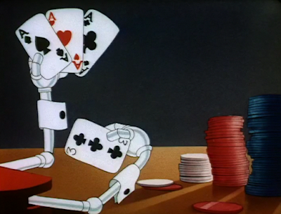


Same with the sudden ring of a gunshot off-screen. A delayed reaction on the robot’s startled take (which is a nice way to indicate empathy through such sentience) feels more natural and believable, giving less “perfection” to the delivery. It would seem much too mechanical if the robot reacted as soon as the noise erupted.

As it turns out, the startled take is actually a case of non-existent mortality making its exit. There are some cheats taken with the punchline that insert some accidental ambiguity; out of context, it does seem as though the robot is reacting in fear. It seems as though the gag is building up to reveal that the robot thinks he’s been caught cheating, when, in fact, another one of his fellow cheating cohorts has been the culprit and paid the price.
Instead, that same robot is revealed to have broken springs and sprockets spilling out in the wide-shot, implying that he was indeed shot. It’s requires a stretch of the imagination, as there’s no way such manglement wouldn’t have been visible in the prior shot. Likewise with the absence of any sort of impact lines, flash, or smoke indicating the piercing of a bullet. Most of the cues depicting the shot are all off-screen, and while that works with the sound of the gunshot, it creates more inconsistencies and questions than answers with the actual outcome.

“Only goes to prove you can’t cheat an honest man... from the picture of the same name.” The addendum of “Plug,” is a rare occurrence where a seemingly unnecessary topper adds to the gag rather than detracts. Thompson’s nonchalant delivery and the obtuseness of the gesture make for a nice combination. That, and considering that Fields himself starred in the aforementioned film.

For all of the animation reuse in the short, recycling some Dick Bickenbach animation from the short’s predecessor does reap some benefits. One of them being, of course, the appeal and charm of Bickebach’s draftsmanship, but that the animation is actually used as a springboard for new, contextually appropriate motions is refreshing—it actually takes advantage of the starting point offered by the old animation and refurbishes it to fit the current needs of the scene. In this case, Fieldmouse threatening to clobber Blabbermouse if he keeps talking (“I’m just the guy that can do it, too… just about my size…”).


This same spiel has peppered many of my reviews, but it is worth repeating that reuse in itself is not a sin. These cartoons were not made with repeated consumption in mind—we were not meant to view them as accessibly and intimately as we can now. Nobody would have noticed the reuse. If it helps save a buck or two and puts less strain on the animators, that’s an admirable feat. Namely, the issue stems from slapdash application of the reuse. It may work on its own in a singular scene, but could prompt the coherency of the entire sequence to buckle through odd cuts, jumps, and other lapses due to the reuse being limited to the context of its original short. Using it as a stepping stone for an idea (with the benefit of cutting some corners in the process) is smart and sensible—critiques about reuse, reuse, reuse wouldn’t nearly be as rife if it was applied with more consciousness as is the case. The application is the issue more than the reuse itself.
Nevertheless, the remainder of the cartoon’s runtime focuses primarily on one “automatic ribbon clerk”—as the name suggests, the robot is able to tie ribbons of all colors and shapes onto any package necessary. Stalling’s musical accompaniment of “Piggy Wiggy Woo” is probably the strongest standout of the sequence; it adds some much needed energy through its jauntiness, but is also easily able to adapt to the action. It turns anticipatory, circuitous, almost drone-like to match the robot performing the demonstration—the physical action of the ribbon tying itself (aided with a third disembodied robot hand, again getting laughs from the convenience of its appearance and straightforward delivery) is likewise depicted as an airy flute glissando that maintains the overarching melody of the song.


Animation of the ribbon and gift wrapping itself is serviceable and solid. Tactility transcends the screen with the robot actually parceling out the amount of ribbon needed for the package—the flow of the material and the tension in the robot’s grip is very believable and very attractive visually. Likewise, that the other offerings of ribbon are all different widths and textures adds further visual richness and contrast to the composition.


Such laborious preparation leading to the robot jumbling the ribbon, tossing it in the box and haphazardly shuffling it off to the next department is yet another demonstration of Freleng’s signature irony. The gag itself is amusing, but the confidence in which it is delivered is even more so.


Predictably, Blabbermouse has much to say about the intricacies of gift wrapping. His spiel here is admittedly one of the funniest in the cartoon through a nod to some ‘40s pop culture that has long since eluded the minds of modern viewers. Even if viewers don’t know of movie star Don Ameche, they know that he is certainly not Alexander Graham Bell; “Gee, that’s keen! I guess ya gotta be pretty smart t’ think of something like that. Gee, that’s better than the telephone! Did Don Ameche invent that, too? Do it again, mister! Will ya, huh? Will ya, mister?” is thus amusing through its affectionate absurdity and how underplayed the reference is. By the time the audience can understand what Blabbermouse has just said, he’s already long since moved on.

Given his fascination with the device, Fieldmouse offers Blabbermouse an up close and personal look at its mechanics. Inclusion of the airy flute motif in the same ribbon tying is an amusing touch; such domesticity is a stark contrast to the comparatively “climactic” stakes at hand.


Regardless, satisfying as it may be to have Blabbermouse silenced for once, the scene almost feels as though it should have taken a different turn. Perhaps that stems from knowing that the short’s predecessor ended the same way. In any case, “RUSH” being an option for the gift wrapping almost seems to allude to its use. As though Fieldmouse would mistakenly press the wrong button, the robot would grab him instead of Blabbermouse, and he would have a taste of his own karmic medicine. At the same time, it’s as though Freleng himself knew Blabbermouse was too obnoxious to go unpunished; having Fieldmouse be the victim and not Blabbermouse wouldn’t seem vindicating enough. Whichever the case, the climax and resolution all seems a bit too convenient and “perfect”; there could stand to be more of a struggle in some way.


There is some good that stems from such a route: the robot smacking a “DO NOT OPEN ‘TIL XMAS” sticker on Blabbermouse, effectively muzzling him, would be repurposed 12 years later in Freleng’s much more competent cartoon Gift Wrapped. Audiences can nevertheless take comfort in knowing that the iris coming to swallow the still-talking Blabbermouse will bring a permanent end to the character.


As I mentioned so bluntly in the introduction, there isn’t much of a way to sugarcoat the quality (or, realistically, lack thereof) of the short. It’s a very flimsy, transparent cartoon that feels like a hastily cobbles together quota meeting money saver. Seeing as so much of this cartoon directly reuses layouts and shots and motifs from Little Blabbermouse, the only logical thing to do is compare and contrast the two.
I still stand by my opinion that Little Blabbermouse in itself is not a good cartoon. It is leagues better than the rehashed leftovers offered here—the grating self indulgences of Ben Hardaway at least somewhat sincere and joyous, which this cartoon is not. Nevertheless, I do not want to make it seem as though Blabbermouse is actually some sort of underrated masterpiece that the public needs to clamor to. It is certainly much more competent in comparison, but even in itself it isn’t a very structurally sound cartoon.

It very well could be one of Freleng’s weakest cartoons to date. (Granted, Jungle Jitters does prove to be pretty stiff competition regarding what is his worst.) Stalling is the true star of the short with his gorgeous, lush orchestrations, there are some pieces of timing that land a laugh from their brusqueness, and there are many aspects of the animation that couldn’t have been executed to the same effect a few years ago, but the directorial shortcomings are just too noticeable. Something this half baked seems more akin to Bob Clampett (I say that with all of the affection in my heart—it’s no secret that Clampett is my personal cartoon hero, but the man did direct Tin Pan Alley Cats, of which this cartoon shares the same relation to Freleng as Tin does to Clampett) than Freleng.
On a brighter note, this is the final cartoon released in 1940, which prompts a retrospective. Thankfully, the year is not indicative of the quality of this short. It was a monumental year of cartoons—not just for Warner’s, but for multiple studios of the Golden Age.

The 1940 year for Warner’s was one that was very important. Its highs and lows seemed more exaggerated than what has been present in past years, and was much less consistent with the quality of its cartoons, but 1941 would thankfully see some gathering momentum that would continue to rise and rise in the years that follow. Bugs’ establishment is obviously the most important takeaway, as he would completely alter the trajectory of the studio, but the christening of Elmer Fudd, as well as monumental character studies such as You Ought to Be in Pictures or even Of Fox and Hounds would also prove formative in the tone, and intent and new priorities embraced by the studio.
Even the more run of the mill, “mediocre” cartoons play their part. Draftsmanship continues to tighten, more risks are explored and taken regarding story structure, gags, and personality, and the animation is growing to a point where even presentation or distortion of certain movements can be seen as jokes in themselves. The objective isn’t “how can we place these drawings in a sequence that convincingly exhibit the illusion of movement and life” so much as it is “how can we make this movement funny and impactful?”

As such, our mission continues to march forth. 1941 would finally see the arrival of the war into the U.S., which had a drastic effect on the identity and attitudes boasted by these cartoons, as well as how audiences would receive the characters. Characters, such as Bugs, Porky, and even Daffy would gain further clarity with their purpose and personality. Comedic, behavioral and animated timing would continue to sharpen, draftsmanship would continue to tighten and evolve, music would continue to meld with, accent, or refute the action, and so on.
It seems this is a sentence that is uttered with every yearly respective on this blog. That’s because it does indeed continue to apply for each instance and is worth reiterating: the unadulterated Warner Bros identity continues to get clearer and within reach with each passing cartoon. These shorts finally have made a name for itself. Now is the time to learn how to make sure it’s a name that is never forgotten.


