Release Date: February 21st, 1942
Series: Looney Tunes
Director: Chuck Jones
Story: Chuck Jones
Animation: Rudy Larriva
Musical Direction: Carl Stalling
Starring: Mel Blanc (Porky, Conrad, Customer Yelling), Robert C. Bruce (Customer)
(You may view the cartoon here, albeit unrestored, or on HBO Max!)
Noting that Porky’s Cafe is the final black and white cartoon directed by Chuck Jones (with the exception being his Private SNAFU cartoons) doesn’t hold the same weight as noting the same for certain other directors; it was only within the past few months that he directed his first black and white short. Nevertheless, the shift is worth the attention, as it signifies the shifting of priorities on a greater level. A studio level. Leon Schlesinger seems to have outgrown his desire to have all of the directors dip their toes back into the main Looney Tunes series. Especially given that, as noted previously, 1942 marks the first color cartoon in the Looney Tunes series.
Thus, Jones’ stint in black and white cartoons may be more fleeting than most, but still remains a fascinating blip in the studio’s history.
More interesting to the cartoon at hand is that Conrad—of The Bird Came C.O.D. fame—is brought back for a second cartoon. Thankfully, some of the kinks present in the aforementioned cartoon seem to be ironed out in this one. Conradisms appear to be included in that. As far as the nose rubbing and laughing go, anyway.In fact, much of this short almost seems to make up for C.O.D. entirely; the pacing is quite frenetic at times, with various stories and gags and convergences all occurring at once. However, all of the above remain true to the ultimate hook of the cartoon: the various goings-on in Porky's eponymous café. Whereas Porky continuously caters to an eccentric, needy customer, chef Conrad finds himself locked in a culinary battle with--you guessed it--an ant.
Opening titles are cleverly displayed on the window display of the establishment. Perhaps even more cleverly, the actual credits for the artists dissolves to give way to the shared title of short and restaurant respectively. Obviously, the decision makes sense, in that the cafe needs a visible advertisement in some form, but fading to nothing--no title, no credit--seems like the easiest compulsion, or panning down directly with the artist credits intact. The latter being a bit more metaphysical, but nevertheless. This is all food for thought, and the transition between titles works fine as it survives now. Merely interesting to note in the approach taken, as most things are in these analyses.
Viewers are met not with Porky as their first official glance of the cartoon's contents, but Conrad, preparing pancake mix at the griddle. Like C.O.D., his appearances are largely kept silent. His communication is mostly conveyed through pantomime. In this particular case, however, Carl Stalling's demure orchestrations of "Gavotte" seems to offer a voice in itself: all acts of pancake making are dutifully timed to the music.
Extra emphasis on dutiful, as the synchronization between sound and animation is startlingly sharp for Jones' standards. Such adherence to the beat, pouring the pancakes on every pluck of the strings, millisecond pauses accounted for as Conrad utilizes two additional griddles, is Freleng-esque in its sharpness. Perspective shifts ever gently throughout the sequence, the diagonal griddle stretching into the foreground and eventually extending into more neutral means of composition with the portable additions.
Not only does it incite visual interest, keeping the audience engaged through such dimensional angles--it likewise offers a tangibility to the musical beat, as the audience is able to see the negative space on the griddle and make the quick deduction that the space will soon be occupied. That, in turn, allows them to anticipate the musical timing. It's almost a physical, pushing sensation, in that the viewers can see Conrad physically pushing along and meeting his musical obligations with how much space is available for him. Whether its for pouring the pancake mix or flipping it, the effect is unanimous just the same.
Ditto with his satisfied, cocky nods directed towards absolute nothingness.
In accompanying Conrad's surprised take, Stalling ends the melody on a final discordant note; native enough to the melody to complete the rhythm, but disruptive enough to indicate that something is objectionably amiss. Structuring of this entire pancake sequence is intended to be repetitive, rhythmic, impressive in multiple senses through its obligation to timing and structure. Thus, any deviation from that is impactful and jarring--the exact reaction Jones wants.
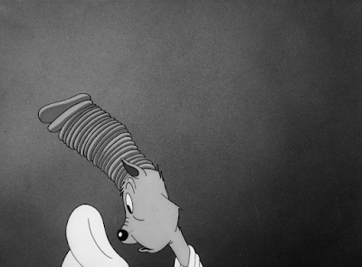
Of course, it proves imperative to keep in mind throughout all of this that this sequence is involving Conrad. Conrad problems instigate Conrad solutions. In other words, all of the pancakes have miraculously stacked on top of his head, and not once is he ever able to get a clue.
While the outcome begs a bit more creativity, Jones does, surprisingly, handle it well. Conrad smacking his lips in staunch contemplation evokes flashes of C.O.D.'s insufferable repetition through bodily noises, but is only an isolated incident. Animation of the pancakes is handled with solidity and grace, convincing in their construction and perspective as Conrad dips his head forward. No prior indication of the pancakes landing on his head are given--no sound effects, no physical reaction. Even the registry of the camera is neutral upon starting the scene, with the outcome only visible through a truck-out. The punchline itself could stand to be buffed, but its actual handling--despite being a bit on the lugubrious side--is solid for what it is.
Simple, bold contempt in which Conrad slaps the hat back on his head, effectively shielding his catalog of lost pancakes, is appealing and clear. Very strong drawings; another benefit that C.O.D. was often without.
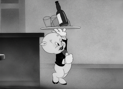
The camera dutifully dissolves to another asset that C.O.D. lacked: Porky. More accurately: Porky's hand balancing a tray. Already from the voice alone, audiences don't need to engage in any exhaustive detective work to know that the person signing "Start the Day Right" is Porky. Nevertheless, the decision to obscure him behind the countertops is engaging and cute, even if any surprise aspects are proudly missing.
Its intent is not only to orchestrate a more engaging and visually striking introduction for the character, but to convey an endearing sense of vulnerability that Jones loved so much. In this case, it manifests through size; Porky, the esteemed owner of this café, possessing enough esteem for his name to be emblazoned on the front window, isn't even tall enough to reach the counters. His authority is politely called into question.
Animation of his walk cycle is well executed. Bubbly, bouncy, the ebullience in his singing is dutifully reflected through his bouncing strides. Almost to a degree of eliciting concern--the bottle and glasses wobbling on the plate as he bounces don't appear to be particularly sturdy.
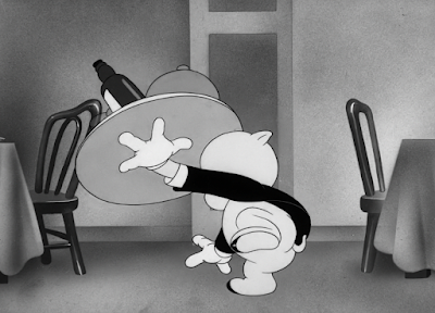
The most inspired moment of the animation, however, arrives when Porky's attention is called offscreen. Arcs guide his stumbling as he struggles to get his footing, platter and accessories dangerously close to falling on the ground. Multiple actions dominate at the same time: Porky turning his body, repeatedly jumping from foot to foot, his hand momentarily losing contact with the plate, the frantic, almost aimless sweeps of his arm as he struggles to balance the weight, and so on. In spite of this frenetic animation, aiming to disarm the audience and make them believe Porky is going to topple over, a unifying sense of organization prevails. The timing and actions are rapid enough to evoke urgency, but still follow arcs and maintain their clarity to ensure the audience isn't lost in the excitement.
Blanc's repeated screams of "WAITER!" have all the benefits of being a bonafide Mel Blanc Scream. The harshness, the comedy factor, and the echo. So, of course, to make an already amusing delivery even more funny, Jones opts to have this eruption come from the mouth of a diminutive, eccentric patron, whose voice seems larger than his own stature. An extension of the patented Jonesian "little man" first introduced in Saddle Silly.
Not only that: his lip sync is completely asynchronous to the force of the sound. It almost reads as a boggling accident, as though something was violently lost in translation--there may be a slight chance that such an outcome is indeed the case. However, the intensity of the yell and pedestrianism of the animation itself both seem too purposeful and controlled in their respective intents. The humor, in this case, is solely tied to the dissonance. Contrast creates comedy.
Bobe Cannon has the luxury of actualizing this delightful discord. His touch is most visible on Porky, who appears like a slightly refined version of his appearance in Clampett's '30s cartoons; rapid head tilts, curved mouths, elongated snout and cheek/lip lines all prove to be dead ringers.
Whereas Blanc may provide the ear splitting screams of the patron, Robert C. Bruce assumes the formal role of the customer himself in a rather rare foray out of his usual type casting. Bruce has been known to voice incidental characters every now and then--oddly enough, the '50s would see a brief renaissance of his talents, casting him in more character roles (such as the owner in Feline Frame Up)--but his ties to his role as everyone's favorite patronizing narrator are so innate to his talents. Thus, straying from such, especially in a role like this one where he puts on a stilted, deep accent, certainly proves novel.
In keeping with that comedic novelty, the customer asks for an order of alphabet soup; specificity is always an easy choice for comedy. Some of the short's surprisingly brisk timing is thereby initiated through this request: Porky rushes in and out of the kitchen in a literal flash. Porky himself is timed on ones, whereas the doors opening and closing in his wake are held for more frames, allowing for Porky to seem all the more abrasive and fast through such a buffer. That, and the end result appears much more natural than if the doors were also timed on one's. A welcome consideration of how the environments he interacts with are affected by speed.
Conrad finds himself a victim to the same speed. Somehow managing to have solved his pancake debacle (most likely by ignoring it entirely and starting fresh), he makes preparations to plate his culinary pride and joy. However, directly cutting to such a domestic and calm scene after the previous showcase of breathlessness communicates that Conrad too will succumb to the same breathlessness.
Sure enough, Porky accidentally makes an escape with his pancake. One might call into question that he slides across the griddle to reach the customer, given that it's been implied that said griddle is on. The answer to any ignorance of burns, of course, boils down to the fact that it isn't a comedic priority. Attempting to work around or explain it would be too much of a hassle and kill the momentum--something that can't be afforded in a sequence of cuts attempting to be disarmingly fast. So, a confident disregard is the second best option.
It helps that the scene sets itself up for Conrad to react and grapple with yet another pancake loss. Perhaps if that wasn't the case, viewers may be less inclined to suspend their disbelief. Then again, if Conrad wasn't there in the first place, viewers may not have any reason to believe that the grill is even on.
...granted, both palms from Conrad are placed down on the griddle as he gawks in disbelief with his sudden loss. Similar logic applies, and effectively so; viewers are much more concentrated on the action and thoughts of the characters rather than the specifics of how a background prop works.
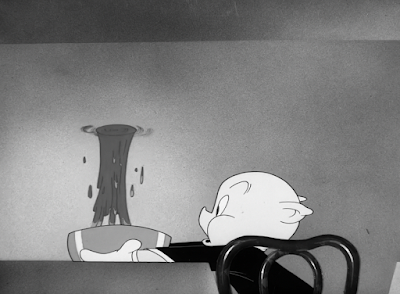
To further caricature the endearingly aggressive display of speed, Porky's soup physically leaves the bowl and hangs in the air, unable to succumb to the same braking halt. Cannon's animation--once again characterized by the thin, wide cheeks on Porky as he smiles--is attractive and appealing when focusing on Porky and his construction, but energetic and sprightly enough to meet the needs of dynamism necessary for the gag. A quick flurry of drybrush accompanies Porky as he screeches to a halt; it may only be visible on screen for less than a second, but it aids in selling the sensation that he's reverberated to a controlled stop. Something the soup floating in the air can't say for itself.
Even the animation of the letters falling into the soup--delivered via typewriter, of course--is remarkably clear and lithe. They fall out of the typewriter in a tall, exaggerated arc; Jones sacrifices cartoon physics for clarity, which is arguably a much more important priority when dealing with such a sudden onslaught of visual information. Numerous letters of multiple variations are all birthed from the same machine at the same time. Ensuring that this reads clearly is a must, in that the potential for the action to become incomprehensible and fold in on itself is strong. Kudos to Cannon and his clarity.
Like The Bird Came C.O.D., Chuck Jones wrote and provided storyboards for this cartoon himself. And, just like C.O.D., the short occasionally falls into trappings where some shots don't flow together as well or are as smooth in their hook-ups. Thankfully, nothing is as egregious as the continued lack of consistency in the former, but a slight narrative jolt is induced as the camera cuts from Porky typing into the bowl to the customer already acquainted with his soup, now in a different position and without any sort of tracking with the alphabet noodles. It's a small thing that most viewers aren't going to notice, but does make a slight difference in how they interpret the flow of scenes.
Deftness is sure to be had in the timing of this cartoon. Porky's entire retrieval of the soup exhibits as such. Nevertheless, the short does remain prevalent in its utilization of frustration comedy--gags themselves, such as the customer struggling to blow the steam off of his soup--aren't always quick in nature, but are usually coupled with some form of energy. Spontaneous anthropomorphism of the steam mirrors such cartoons as Good Night, Elmer, which is frequently lambasted for its own lugubrious pacing; the same comedic principles are here in the steam's refusal to obey its customer, zipping back and away from the bowl at will, but the overall tone and execution surrounding the charade is much more light on its feet.
It does nevertheless wear out its welcome, in that close-up shots of the steam hiding or any sort of camera movement seems extraneous. The joke isn't engaging or funny enough to warrant such directorial attention; it very much is loyal to the Good Night, Elmer school of comedy.
At the very least, the customer engages in a resolution (contemptuously smothering his soup with his cap), soothing any frayed nerves and communicating that, no, this will not be a cartoon dedicating its entire runtime to a man fighting with steam. Focusing on such antics feels arbitrary, but it does offer a palpable antithesis in tone to the freneticism of the sequences prior. That, in the end, keeps the overall short more engaging by striking such a balance. There are better ways to exhibit said balance and find that rhythm, but it does demonstrate an awareness of how the parts make up the whole.
Returning to Conrad yields similar observations. Granted, those observations may fall into a similar sensation of recollecting past cartoons, given that the Jones Ant of 1941--now without the racist connotations--makes a return by slipping into the baking supplies. Jones' art direction in these moments are much more meticulous, careful, a lushness that yet again connotes cartoons of a gradually bygone era. His shorts are still certainly lush and striking in their visuals, but caricature in speed and elasticity have become more of a priority. Seeing a scene that takes its time, relishing in the details such as falling grains of sugar or the firm construction in Conrad's hand as he stirs, elicits a memorable and effective contrast against the faster antics.
Cutting back to Porky taking further orders from the customer proves this. Granted, the actual banter of order taking isn't necessarily frantic and fast--quite the opposite, given that much of its "hook" arrives from Porky giving a dutiful "yes, sir!", rushing off, customer adding an additional order, Porky "yes, sir!"-ing again, and repeating the exchange a third time. The rule of threes is always helpful in arranging gags and ideas in a rhythm, but the third and final exchange feels a bit overkill. All that needs to be communicated has been communicated. Especially given that the customer's order itself falls back into the aforementioned humor via specificity: "A combination sandwich and cheese, liverwurst, lettuce and tomato, salami, sauerkraut, peanut butter, mustard, pickle, relish and mayonnaise on whole wheat toast... and hold the onions," is nothing if not specific.
Self awareness from the customer proves to be the better gag than the repeated "yes, sir"-ing, particularly given its subtlety: understanding the asinine extravagance of his order, he even provides an inkwell for Porky to dip the feather from his hat in. Both actions occur practically simultaneously, streamlining the order of operations and ensuring a confident delivery of a clever yet cute gag. A knowing self awareness from both parties that is more interesting and less forced than continued addendums.
Regardless, if there are addendums to be had, "hold the onions" is always a classic, and of particular note here--Phil Monroe was the one who came up with the line while working for Friz Freleng in 1937's Pigs is Pigs; thus, given that Monroe was animating in the Jones unit at this time, the reference feels fitting.
Compensation is due for the purposefully long-winded monotony demonstrated above. With the same fervency that was used in preparing the customer's soup, Porky proudly presents the needlessly complicated order given just seconds before. Reusing the same layouts and even actions as the prior soup sequence--same shot of Porky going in and out of the kitchen, same pacing, same crescendo in the ongoing orchestrations of "Keep Cool, Fool"--induces continuity and familiarity. Thus, the cartoon has a greater illusion of structure.
Catching all of the parts of the sandwich like a baseball catcher is another mischievous, cute, and clever visual that matches the domineering tone of playfulness. Sound effects give an added tangibility to the action, Treg Brown's gentle "pap" sounds enabling the audience to feel the impact more strongly. Likewise, using the same sound over and over again in such a short time lulls the viewer into a sense of comfortable monotony. The loud, metallic, reverberating "PLUNK!" that comes with the final piece of bread thereby succeeds in its intent to be jarring and even satisfying through completion.
Similarly impish sound effect remains consistent, a harmonica chord accompanying the action of the customer smashing the sandwich down into an edible accordion shape. Interesting to use a harmonica sound over accordion--perhaps there were concerns of predictability by doing so. Regardless, the harmonica proves to be a surprisingly effective stand-in.
Convenience of smushing this towering comestible into something so tiny and, thereby, edible is intended to arouse some amusement, but the main point of interest comes from the sandwich accordion-ing itself right back up into a neutral stance in the customer's throat.
Getting to this point does initiate a few directorial oddities in the process; the expression of the customer after he's eaten isn't necessarily funny, but a bit uncanny and formless. Likewise, the camera makes a dutiful pan left to ensure the oncoming accordion gag is executed with full clarity. A noble intent, but one does wonder if the scene could have been staged in a more productive way at the start to reduce this--any suddenness or surprise aspect of the punchline is diminished by this accidental foreshadowing, and the lugubriousness of the camera movement certainly doesn't help.
A cross dissolve back to Conrad continually familiarizes the viewer with the "Conrad, Porky/Customer, Conrad, Porky/Customer" format adopted by the cartoon. Or, perhaps more accurately, "Conrad/Ant". Each point of focus largely follows the interactions between two characters, again encouraging the overall sense of balance in the cartoon.
Here, audiences are soon to be reminded of the ant's presence through the sculpted, dimensional close-up of the batter being poured onto the griddle. It almost elicits comparisons to Jones' universally beloved classic Feed the Kitty 10 years later, what with the bulldog thinking the cat has been made into a cookie and all of the focused shots dedicated to the cat exploring the various baking processes. Granted, Porky's Cafe proves less heartwarming and less focused on pathos than its counterpart--even having the ant be successfully baked into a pancake (and expressing pain through such, Blanc offering a hoarse whisper of "Ouch!" offscreen) bears a certain brusqueness through the actualization of the ant being baked.
Once more, Jones gets just a little trigger happy with his cuts--a bewildered expression from Conrad directly cuts to the pancake, now fully formed, hopping up and down repeatedly on the griddle. The close-up of Conrad is used as an insert to allow this cheat to happen, which is understandable and clever--the thinking is that enough time has elapsed in this shot for the pancake to form, the ant to find his footing, and for the ant to be hopping up and down. However, it does feel just a bit too sudden in execution. Padding the scene with a few additional frames of the pancake actually springing upright would take care of such an issue.
A more purposeful sense of abruptness is initiated by Conrad's reaction to the anthropomorphic flapjack. Instead of struggling to ponder how this could be, staring into his mix of batter or scratching his head, both he and Jones cut right to the point: the offense. The wind up of his hand lasts much longer than the actual act of his hand coming down and hitting the grill--one ease out of the hand forward, with streaks of dryrbush filling in the missing gaps as the next frame has his hand right on the griddle. A much stronger, more palpable impact that way.
Ditto with his reaction, which serves as another jump between two key poses--no in-betweens. This concocts a bit of a "companion piece" to the equally sudden timing of the hand coming down, which enforces a balanced rhythm in action. Airbrushed glowing effects around the silhouette of his hand prove to be an effective shorthand for a throbbing burn; working in black and white requires more creative solutions than just the usual inking of the hand red.
Yet again, the camera makes a dissolve to the same composition and same idea of Porky taking the customer's ridiculously exhaustive orders. Bobe Cannon seems to be the animator exclusively cast for this set-up. That certainly isn't a complaint, as his work is appealing and cute--under his tenure with the Clampett unit, Clampett would typically assign him focused dialogue scenes quite reminiscent of this one. It seems his talents of making mundane banter into something attractive and serviceable doesn't go unnoticed.
Specificities continue to pave an avenue for comedy, as the customer orders a demitasse. Porky informs the gent that they are indeed without demitasse, making a point to repeat the word of the day to further assert humor via particulars. The way it is recounted here sounds dismissive, but that is absolutely not the case--just interesting to track Jones' intent by breaking it down to its barest essentials. Humor through distinction is a gift, and is a big contributor into Mike Maltese's success as a writer. In fact, Maltese himself was the first to do a demitasse joke with Freleng's Porky's Bear Facts. Jones wrote this short himself, but his own insistence on particulars hints at why he worked together so well with Maltese.
Repeating the same layout of Porky rushing into the kitchen prepares the audience to brace themselves for another whirlwind of food to come out the adjoining door. That it doesn't proves to be one of the biggest subversions of the cartoon so far. In spite of its spread out organization, the vignettes with Conrad peppered in-between, the Porky and Customer banter does subscribe to the rule of three's: this is highlight number three, which offers a change in pace by actually following Porky into the kitchen. To repeat the same rush of food for a third time with the same timing, same general idea, same staging, etcetera, would be to enunciate any and all monotony beyond intention. The demands of the customer are supposed to seem ridiculous and repetitive, but not in a way that steers the most important customers--the viewers watching this--away.
In accordance to the customer's order of a T-bone steak, Porky, logically, sifts through a filing cabinet labeled alphabetically. Audiences aren't immediately aware of where this joke will lead to, but are able to be amused and entertained by the the staunch obedience to organization in itself; a gag that is made absurd through a rather oxymoronic dependency on grounded logic. There's a certain domesticity innate to the strict organization of file cabinets, alphabetical order, etc.
Additionally inconsequential note, but intriguing to note regardless: Porky's hooves are indicated on a separate cel layer, kept still as the rest of his body moves idly while searching for whatever the "T" may entail. This is standard animation practice and a well-known bit of economy--in later years especially, it would become the norm. That wasn't exactly the case in the early '40s.
The object of his search if finally unearthed: a large, T shaped stencil. This in itself offers even another alternative means of humor to be found in the stencil metaphor: given that there is an entire filing cabinet with alphabetical labels, that implies that this enigmatic café that Porky runs also offers such comestibles as a Q-bone steak or a J-bone. Certainly not the funniest joke(s) in the world, but the commitment to the overall idea is commendable.
Commitment that is evident in a close-up of Porky carving a T out of a slice of steak. Some directors may have gotten enough fulfillment out of the filing category metaphor to end on that note alone--Porky needs a T bone steak, Porky finds a T, insert a sardonic music sting, move on. Jones' lingering on the actual process of preparing the meal is helpful in seeing that the punchline is fully realized, of course, but it likewise seeks to establish that this seemingly throwaway punnery isn't exactly all that useless. No matter how polite the gag is, there's a dedication behind it, and that can often be more admirable than the actual success rate of the joke itself.
Had this short been made a year or so later, the image of such wasted meat likely would have been poked fun at. Many a cartoon awaits us centered around the woes of food rationing and Roosevelt's Meatless Tuesday policy, which was a holdover from Woodrow Wilson's same policy during WWI.
Especially given that what meat Porky does intend to use has now been shriveled up into oblivion, amounting in the final realization of this entire sequence: a shriveled up lowercase t instead. Clever, cute, and successful through Jones' adherence to seeing the joke through. Porky's animation itself is a bit less on the appealing side, his features feeling unanchored to his construction and the jaw not properly supporting his cranium. Nevertheless, the action on the meat itself is intended to be the larger point of focus, so it gets a pass.
Having the steak erupt in a burst of smoke does, oddly enough, foreshadow one of the main points of intrigue for the coming sequence. Sound effects of the smoke bursting are all vocal, distinctly coming from someone's--most likely Mel Blanc's, but it can be difficult to say--mouth.
The exact same true is the case for the next 35 seconds that follow the culinary process of an egg on toast. Rather impressively, there are very few camera cuts in tracking the process, and what does survive is very minor and immediately padded by more pans. Porky's Cafe is just one of many cartoons to feature an elaborate, Rube Goldberg adjacent contraption--it isn't even the last Chuck Jones Porky cartoon to do so, with Trap Happy Porky featuring another elaborate sequence that would be reused in future cartoons.
With Carl Stalling's slightly discordant, mechanical but jolly accompaniment of "Tica Ti, Tica Ta," underneath, almost all actions of the Goldberg machine are accompanied with purely vocal, "homemade" sound effects. Raspberries, pops, whines and squeaks, etcetera. Some sound effects remain native to the library of Treg Brown (scraping sounds, boings, tin plunks, crank sounds), but the prevalence of vocal, guttural noises makes them easy to miss.
Admittedly, some of the vocal effects can become a bit grating after while, accidentally attracting too much focus on the sounds and potentially diluting some of the action in the process. It's nevertheless a welcome burst of creativity that matches the tonal whimsy of the Goldberg contraption exceptionally well. Hearing and seeing such a technique in a Chuck Jones cartoon proves particularly novel, as he doesn't necessarily seem like the type of creative to indulge in something that may be seen as juvenile. To find this in a Bob Clampett cartoon would be much more likely.
That certainly isn't a complaint, and the effect nevertheless proves memorable and effectively playful. Animation is solid, meticulous, again embracing the "old school Jones" style of excessive detail and sculpted animation, whether it be in characters or props. Actions are easy to follow, camera pans are smooth, what few cuts persist don't jostle the viewer out of the momentum, etcetera. Jones certainly seemed to be a fan of his mechanical comedy--this is everything that the humor in Dog Gone Modern wished it could be. Impressive improvement to be had in just three years.
On the topic of throwbacks, the carafe from which Porky pours some coffee has a little glass topper in which the coffee spurts and boils--a visual incredibly rife in the '30s cartoons, usually involving any and all car gags. Solidity from the animation from as Porky pours the coffee is strong, tangible, offering a realistic antithesis to the lighthearted transformative nature of the coffee pot gag. Again, some of Porky's features--particularly the eyes--could stand to be anchored onto his construction just a bit more dutifully, but the act itself of pouring the coffee is solid, realistic, and sharp.
Porky's Cafe does fall into some of the same trappings of The Bird Came C.O.D. Not nearly to the same extent (as the short is much better off for it), but both seem to prioritize details, gags, vignettes. Occasionally to the sacrifice of the larger picture. Sure enough, no mention is ever made of the T-bone steak or Goldbergian egg on toast. There doesn't necessarily need to be, as both highlights have met their comedic quotas, but they certainly feel dropped much too suddenly in favor of the coffee gag. Especially when we see the customer drink the coffee, but make no mention of any other aspect regarding his exhaustive ordering list.
Correction: a plate of unidentifiable mush seems to be the egg on toast, which is a start, but the directorial flow of events in which the cartoon seems to abandon the aforementioned ideas does remain a bit hindering.
Consumption of the coffee offers an extension of the sandwich gag seen earlier. Same layout, very synonymous glance towards the camera--albeit a bit less uncanny this time around, no hunched posture or squinted eyes--same validation-seeking pause, and same comedic eruption. This time, the customer's head bobs up and down off of his head, eyes swirling to mimic the motions of the boiling coffee. Certainly a polite gag and not as intriguing visually as the earlier sandwich lodged in his throat, but an effective means of harkening back to earlier gags and establishing a sense of continuity as a result.
Conrad eyeing the seemingly anthropomorphic pancake establishes its own continuity, too. A somewhat general sense of arbitrariness seems to persist, subtly connoting the aimlessness and arbitrariness of C.O.D. Not to the same extent, of course, but viewers do somewhat ponder why Conrad can't attack the ant/pancake amalgamation more quickly. The obvious answer is that it'll jump out of the way, which is true--regardless, the pacing and timing of the scene feels as though it could be a bit more strict. More purposeful in conveying that Conrad is waiting for the perfect time to strike.
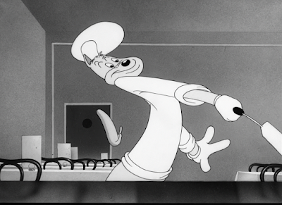
At the very least, Conrad's expressions are appealing for the change (especially the contemptuous side eye to the camera), and the scene places a heavy emphasis on musical timing. Just like Conrad's introduction. Idle, almost mockingly free footsteps of the ant are accompanied with leisurely string beats--the orchestration rises into a mischievous crescendo as Conrad prepares to strike, with the smack of his spatula offering perfect percussion right into the beat of the music itself. Smears do a fine job of adding additional urgency to the gesture and conveying a different sense of force in his movements.
...even if all of that does amount into a bit of an odd vignette in which Conrad attempts to calm himself down. With a forceful truck-in to his face, Conrad breathes a raspy, hoarse, strained "1...2...3...", etc., to prepare himself from exploding. The contempt and force in Blanc's vocals is palpable, and amusing for this reason--just a bit of an odd creative choice. At one point, the lip sync goes completely out of whack, which is not particularly helpful in a scene that puts so much emphasis on Conrad's face and what he is saying. Attention is explicitly called to his face. Eyes are on his mouth movements.
More coaxing nevertheless commences, with the camera reverting back to its neutral framing. Similar to the camera following Porky into the kitchen, the fact that the camera trucks back indicates that more antics involving Conrad and the ant are imminent--another breach in protocol, given that Jones has established a pattern of cross dissolves. About a minute of runtime remains, so to cut now would be fruitless. A resolution is in need of resolving. An ant is in need of catching.
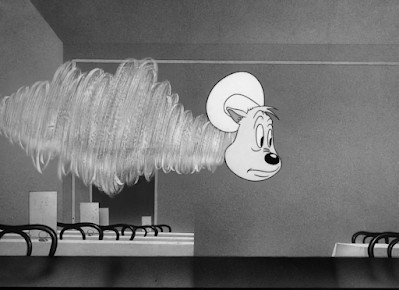
Conrad's attempts to attack the runaway pancake amount in a rather surprising and striking abstraction: a constant flurry of dryrbrush. The drybrushing is heavily controlled in its animation, remaining confined to one spot and touting a confidence and direction in its movements, but lacks form. For the sake of what this "gag" is attempting, that is an absolute bonus--confining itself to Conrad's silhouette and Conrad's silhouette only would lose the freeform sense of catharsis that survives. It's intended to be nonensical.
Especially when Conrad--fully formed Conrad--pokes his head out amidst his own whirlwind. A strong, effective contrast that allows the audience to savor the asinine intensity of his attempts.
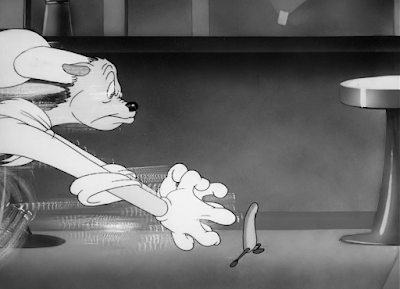
Thus, the short sets out on its climax: a chase between a cat and his pancake. Ridiculousness of the scenario is offset by the committal to the theatrics. A self awareness with how bewildering the entire set-up is certainly is felt, particularly in the preceding scene mentioned above, but Jones does stick to his guns for the large part and induces a genuine sense of alarm through climactic music, comparatively quick pacing, dynamic camera angles, and so on. It certainly doesn't choke on its own attempts to be funny or smarmy. It just is. And that's a technique that the Chuck Jones of this period could certainly stand to harness.
Backgrounds in one camera pan are blurred and airbrushed to simulate a whirlwind sense of speed. A sharp consideration, but the overall effect proves to be a bit lacking when the camera pan itself isn't very fast. When the camera is as "neutrally quick" as it is, the background ends up communicating its barest essentials: blobs of airbrushing intended to simulate speed, rather than an actual caricature and demonstration of speed.
Nitpicking aside, it proves to be a smooth transition to Porky. Particularly the blink-and-you'll-miss-it perspective animation of the kitchen doorway.
Porky's reintroduction is dominated by a wonderfully strong lack of synchronization. Whereas Conrad is engaged in this mad dash against his runaway pancake, Porky remains lost in his own little world, dutiful to his obligation of serving his only customer. Obliviousness is most apparent in his happy, smiley demeanor, but the decision to have him hum his reprise of "Start the Day Right" proves most effective. In spite of his singing, Stalling's orchestrations remain consistent in his hurried, frantic music score; thus, the two sources of music clash, rendering Porky all the more ignorant--perhaps to a degree of potential disruption. Showing him walking against the flow of the camera movement proves to be another subliminal indication of resistance. Through this, audiences are braced to expect a collision.
Their instincts are vindicated. Execution of the altercation is perfect--Treg Brown's smacking effects arrive with an echo, really conveying a sharp impact that fully narrates the actual animation of Porky being flung off-screen. Suddenness in which his voice cuts off from his singing is similarly effective. As funny as they are to hear, interjecting a classic Mel Blanc scream after he was hit would likely dampen the guilt-free mischief in the tone; it implies pain, which evokes pathos, which detracts from the adrenaline of the chase. Keeping him quiet allows the audience to succumb to their impulses and laugh first rather than pity. Moreover, the action of Porky being flung out of the way is given greater star power--Blanc's vocal prowess can be all consuming, and especially in the case of an exclamation. Comedic priorities are on the actual act of Porky getting thrown out. Not how he reacts to it.
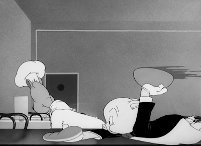
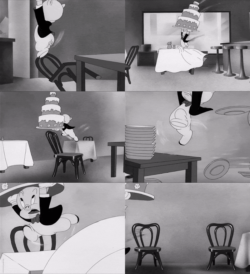
Amazingly, he seems relatively unscathed. "Relatively", given that the next sequence follows an impressively executed camera pan of him struggling to maintain the balance of an asininely elaborate cake. Perspective of the environments and animation alike are strong, free flowing, coherent, no hiccups in the camera flow. Movement and balance is the priority of the animation rather than the drawings themselves, but said drawings are solid and focused in the moments that they do have greater prevalence. The maintenance of so many different actions--tripping, sliding, etc.--and refusing to have it falter once is impressive alone, but doubly so when the subject is constantly weaving in and out of perspective. Definitely a climax worthy shot if there ever was one.
In fact, the visual of Porky threatening to lose his balance is so intoxicating that the audience has almost forgotten about Conrad and the pancake completely. To see them rush back into frame at the very last second evokes a bit of mental recalibration.
Just as cutting to Porky indicated an impending collision, cutting to the waiter about to indulge in his next round of food illustrates the exact same point. All characters and plot points have successfully managed to converge into one final resolution. And with a resounding bang, at that.
A cloud of dust is the time honored tradition of transitions in such scenarios. It certainly proves helpful in easing the changeover from a wide shot to a long, gradual vertical pan upwards that focuses on detail over action. Imagery of Porky as a pig roast is cute and fitting, benefitted from his clearly contemptuous expression. For him to show vacancy or befuddlement, blinking coyly with crossed, downward eyes, may be a bit too cloying for the tone that Jones was intending. Instead, such disdain--no matter how temporary--gives the visual and ending as a whole a welcome bit of edge and self awareness.
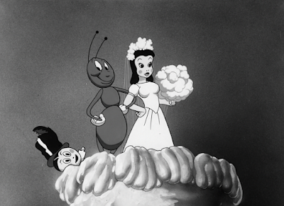
Other star players in the cake are greeted with reprisals of earlier gags: the boiling coffee for the customer, the stack of pancakes still under Conrad's hat. Perhaps insignificant details now, but details that indicate a certain attention and understanding of the story. Or, at the very least, excel in the illusion of a coherent storyline by revisiting past ideas.
What seems to be a scoreless victory for all actually boasts one final exception at the top of the cake. Pancake out conveniently out of sight, the ant asserts himself as the true "winner", proudly posing with the cake-topper and reveling in his victory. At least someone comes out of the ring content.
The introduction to this post mentions a feeling of compensation in this short. And, having analyzed the short from top to bottom, inside and out, those same feelings persist. While it certainly isn't to imply that this short solely owes its existence to the misfire that is The Bird Came C.O.D., the general pacing, tone, and execution of the short do feel like attempts to make-up for what failed in the aforementioned cartoon. It proves difficult to think back to a Chuck Jones cartoon released to this point that has the same intensity in its speed.
In fact, the speed in its animation and pacing, as well as overall attention to detail, prove to be the main draws of the cartoon. Actual story and plot of the short proves to be quite vacant--Porky feeds a customer, Conrad deals with an ant--yet, thanks to these measures, is able to feel like much more than that. Details are the name of the game with Porky's Cafe. Meticulous close-up shots and sculpted animation are one avenue of striking these details. Consistency in gags and story, referencing previous ideas, etc., are another.
Conrad's role in the short is particularly worth mentioning. Some leftover compulsions from C.O.D. occasionally leech into the cartoon, but is mostly concentrated in the beginning and has the benefit of being much less insufferable than the former. He still remains far from being an appealing, compelling character, but has the benefit of not driving the audience wild through desperately obtuse acts in the guise of comedy. It helps that the overall art direction in this cartoon feels more solid, controlled, and focused than the blobular, muddy C.O.D.
On its own, Porky's Cafe isn't necessarily what one may call a "sleek" cartoon. However, against the remainder of Jones' filmography released up to this point, it absolutely feels streamlined in its pacing and execution. There's an adherence to speed and even musical timing that has seldom, if ever, been seen in his shorts yet. The Draft Horse would be the true turning point of comedy for Jones, but this short--as pedestrian as it may seem nearly 82 years later--serves as a promising omen to the comedy and lengths he would achieve out of speed, speed, speed. Something worth noting, given that one of his most memorable characters revolves entirely around his ability to outrun a coyote.





















No comments:
Post a Comment