Release Date: August 16th, 1941
Series: Merrie Melodies
Director: Friz Freleng
Story: Mike Maltese
Animation: Gerry Chiniquy
Musical Direction: Carl Stalling
Starring: Reid Kilpatrick (Narrator), Mel Blanc (Bikers, Gabby Hairnet, Football Players, Referee)
(Albeit unrestored, you may view the cartoon here!)
A bit of history is enacted through this seemingly—and correctly—inconsequential sports themed spot gagger: Gerry Chiniquy receives his first animation credit.
Readers of this blog may recall Chiniquy’s role as the director in You Ought to Be in Pictures. As has been stressed before, the credits system for these cartoons is largely incondite; credits between animators and even writers operate on a rotating basis. For instance, both Mike Maltese and Tedd Pierce collaborated on the Chuck Jones classic Hair-Raising Hare, but it was only Pierce who received a credit… much to Maltese’s rightful chagrin. Animator credits are the same, if not often more inaccurate—whoever receives the honor of their name plastered on the title card is often completely random. Chiniquy doesn’t receive a credit here because it’s his first short he’s worked on. Still, the opportunity presents itself to give him a proper introduction.
Chiniquy plays a heavy role in the Freleng unit. Not only did he stick with him until the end of the studio’s lifespan, but he’d also join Freleng over at DePatie-Freleng Enterprises to both animate and direct. Following the retirement of Hawley Pratt (another one of Friz’s right hand men, so much so that there was a push for him to receive a co-director’s credit much earlier than he actually did), Chiniquy was made the head director of DFE and oversaw practically every series produced. His stint at Warner would yield a few directorial experimentations in the mid ‘60s as well: Dumb Patrol and Hawaiian Aye-Aye.Freleng got a liberal amount of mileage out of his talents, often casting him as his “dance animator”. Perhaps there’s no dance more iconic than the entire opening to The Bugs Bunny Show which—you guessed it—was the product of his animated handiwork as well. Anyone presented with the opportunity to animate one of the most famous television theme songs of all time is certainly up to snuff. Indeed, to deem Chiniquy’s contributions as “up to snuff” is an understatement.
Unfortunately, no grandiose dance sequences or vaudevillian homages await in Sport Chumpions, as it is too preoccupied with learning the ropes of the spot gag format. Indeed, Freleng is now the second director behind Bob Clampett to emulate the format that dominated Tex Avery’s cartoons of the past few years. Exactly as the title may suggest, any and all gags revolve around the wide world of sports.
A world so wide that it is approached with great haste—the narrative tones of Reid Kilpatrick immediately thrust the audience into the cartoon before the title card has finished paying its dues. Timing of the narration errs on the stilted side, in that it reads as an afterthought hastily tacked onto the card before segueing into the action; a heavy pause dominates until the last second.
Nevertheless, the viewers buckle up for the “lowlights in the world of sports”. While this short is very clearly molded after Avery’s approach, Freleng does inject some quirks unique to his directorial sensibilities. Each spotlight is ushered in with a corresponding title card. Affectionately crude stick figures engage in the activity of the minute, dominated by a tongue-in-cheek voice.
This in itself would become a somewhat recurring element of Freleng’s shorts. Shorts such as Hare Force or Life with Feathers feature crude illustrations that reflect the consciousness of their characters, often reflecting on gruesome acts that they can inflict onto others or will be inflicted on to. Lights Fantastic boasts an entire song number sung by stick figures. They’re an endearing, perhaps nostalgic shorthand that communicates an affectionate crudeness; in the case of the two former cartoons, the dissonance between such cutesy visuals and violent tendencies creates a delightfully warped comedic dissonance.Affectionate and endearing is more in line with Freleng’s priorities here than concocting a warped narrative, but the device is certainly novel.
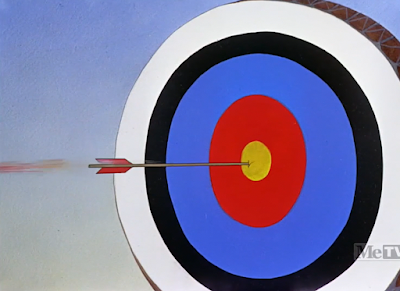
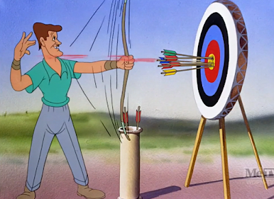
“Here is the modern Robin Hood in action”, our comparatively less warped, more literal narration condescends. This short, if anything, constructs the ideal of the “Freleng human”: lanky, tall, features often elongated and sharp, many of the humans in Freleng’s cartoons would follow in the artistic mold of this no-name archer here. A certain stolidity of sorts dominates—Avery’s humans were often designed to be as zany or abstract as their corresponding gags. More literal means of design philosophies are adopted here, but still with a dynamism and flow to keep them native to the house style of the studio.
Audiences are gifted the opportunity to observe this archer strike bullseye after bullseye after bullseye. Animation on the arrows are convincingly tactile, a frenetic settle into place selling the intensity of the action. Each arrow is, likewise, indicated with fletchings that vary in color to make his victories feel more independent. It’s easier for the action to all blend together if all of the arrows are the same color; one red, one yellow, one blue, and so on account for the subconscious pause taken as the audience digests these new pieces of information.
Reveal of the punchline itself isn’t exactly as thoughtful. An easy compulsion is to insist “Robin Hood Daffy did it better”, which is true… but perhaps not a fair comparison, given that she short follows 17 years after this one.
Even then, the audience isn’t left with a charitable amount of time to wallow in the comedic intricacies of the gag. A jump cut to the next title card—billiards this time—is sudden and jarring, even in spite of the understanding that this is the format adopted by the cartoon. A dissolve or fade to black may have worked better in lessening the abrasiveness of the maneuver. Granted, cushioning each introduction with dissolves and fades would likely grow to an equally aggravating tedium.
“Let’s watch this difficult shot.” This particular Freleng human is a bit more quirky and playful in his design sense, aided by a comparative deftness in the animation itself. Quick timing on his eye blinks and the manner in which he’s drawn possibly give this away as Dick Bickenbach’s work—if so, it would certainly explain the airy boldness in the motion.
A series of layouts give an inflated importance to this “difficult shot”—a view from the other end of the table is followed by an overhead shot, which simulates the feelings of all eyes being on the play. Thus, an added severity to the situation.
The play is observed through the intimacy of that same overhead shot, which shunts the viewer directly into the position of a spectator. No room for any obstacles to get in the way. What we are seeing is complete, unfiltered action… even if that action is the nonsensical motion of the balls moving around the table in the formation of the rack. Treg Brown’s sound effects are convincing and tactile, bestowing a welcome permanence to the action of the balls unobtrusively ricocheting around the table. Ditto for Stalling’s musical accompaniment driving that tangibility home.
An unnecessary pause lingers between the last ball entering the pocket and a dissolve to the next title card, but that too is a nitpick in the grand scheme of things. Observing the time honored sport of ping pong takes much greater precedence.
Especially given that the timing on that title card is somewhat off too. Kilpatrick barely has any time to speak before the camera cuts directly to the action—this could be a purposeful maneuver, in that Freleng understood having someone speak only when words were on screen was time consuming and dull. Stop, go, stop, go. A slight lag sells a more organic sense of timing and direction. However, the title card is literally on screen for one second—that sort of trigger happy maneuvering disrupts the directorial momentum and almost reads as accidental. Preserving any momentum is especially imperative in a short like this, that is segmented and stilted by design.
Thankfully, momentum is the name of the game with the ping pong segment: the entire gag relies around it. Observation of the game is tense and undisturbed from all accounts. Stalling’s music gives way to the rhythmic plucks and plonks and clacks of the ball volleying back and forth across the table. The camera zips back and forth, back and forth, attempting to keep a steady eye on the ball. Viewers barely receive the honor of viewing the players—they’re irrelevant. Only a vessel for the ball to move. Priorities are unequivocally on watching the ball at any and all costs.
At least, this is what is communicated through a crowd shot of the spectators’ eyes bouncing back in forth in a synonymous fashion. Unintentional atmospheres of unease are communicated through the stylings of the painted crowd: it certainly isn’t the work of someone like Johnny Johnsen, who displayed a startling efficiency in painting humans just as he did scenics. Instead, the painting is blobular, grungy, and indistinct, reminiscent of Art Loomer’s backgrounds that dominated many of the late ‘30s Merrie Melodies.
In layman’s terms: it’s ugly.
Still, it’s almost helpful in selling this phantom sense of tension. Between the unbroken eye contact from the crowd, the form of the crowd itself, and the lack of music, the reliance on steely concentration from every party involved is certainly communicated strongly.
A close-up of one particular spectator’s face fares much better in draftsmanship. Any and all uncanniness is intentional instead of an accidental byproduct.
His eyes aren’t following the ball so much as they essentially are the ball—a suspension of disbelief is necessary in digesting the gag, as his eyes/the ball drop to a natural stop. The sound effects and animation in this visual are very convincing, and the gag arouses a genuine stir of amusement through such obedience to sound effects and timing. All of the laborious build-up for a gag so proudly stupid allows it to breathe on its own… even if ping pong matches don’t come to a stop because the ball just decided to halt in the middle of the court and dribble to a stop.
(Another pause lingers for longer than necessary before switching to the next course of action, but that too is forgiven.)
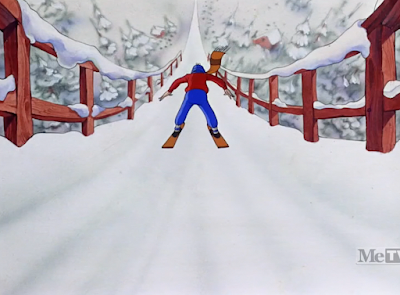
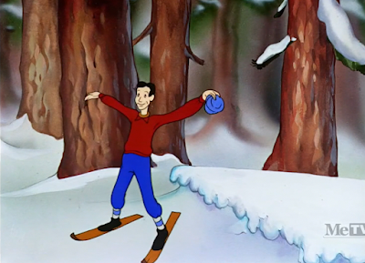
“Each winter, ski jumpers from all over the world go to Lake Placid to test their skill.” Lenard Kester’s background paintings aren’t as ornate or confident as the smooth, glossy sheen that often dominates Johnny Johnsen’s backgrounds, but the commonalities between intent are communicated. Picturesque visuals to match wholesome narrative depictions awaiting their turn to be challenged, subverted, or justified through absurd literalities.
Kilpatrick introduces the audience to the “highest, longest and most treacherous ski jump ever constructed”—a vertical background pan following the dizzying heights illustrate his point. Likewise, the musical orchestrations melt from lighthearted jolly fun to an anxious, foreboding sting. Something or someone is clearly at stake here.
Indeed, that the inkers took the time to even indicate the shadows and highlights on our anonymous ski jumper communicates a certain grandiosity is to be had with this sequence. It’s only a real ski jump if you’re inked with shadows and highlights.
Camera pans to indicate our skier’s nerves; a slight dissonance prevails with the execution in that, too. Sound effects and indicated dry brush sell his knees shaking, but a pause persists—his legs take a few moments to begin shaking themselves, informing a slightly confused tone and direction with the animation. Regardless, the main idea is nevertheless communicated: this is a leap of faith, and not one approached with bullheaded confidence.
Armed with the security of a drum roll, the Freleng minded skier engages in his feat. Simulated camera maneuvers to indicate the skier warping in and out of perspective instill an importance and visual magniloquence, similar to that established with the comparative tedium of his shadows and highlights. Brush strokes in the background turn into streaks, conveying an intangible speed that transforms the background into a blur…
…which results in our grand leap of faith. Sincerity of the triumphant musical fanfare adds a nicely oxymoronic disingenuousness to the joke. There are some technical aspects that could stand to have been elevated in making the gag feel more complete—the descent seems too short, animation and draftsmanship on the skier is a bit vague, the streaky backgrounds seem to be isolated—but the general idea is there. A theme is being constructed.
Little time is wasted as the narrator jumps from one sports extreme to the other—track & field and skiing are not two sports that are often closely compared.
Dissimilitudes extend to execution and direction, too: the runners take off just as the narrator has finished introducing the hurdle jump. No long camera pans, immersive layouts or intricate shading necessary here. Just the crack of the gun, the initiation of an exciting, rushed musical arrangement, and convincing speed both in which the runners chug along at and the camera tracking them. As they run, gradually outpacing the speed of the camera, perspective ever so slightly shifts to make them seem all the more ahead. It’s a subtle maneuver that is very well handled.
Especially given that it accounts for the perspective change initiated by the hurdles—the racers all climb them like ladders before heading back on the track. Rinse and repeat. Perhaps the punchline may be comparatively underwhelming, but the dedication to the gag (the camera and music slowing to match the time allotted as they climb, the shift in perspective, the convincing speed) is appreciated.
Swimming and other aquatically themed sports dominate the next minute and a half to give the cartoon some tangibility. These spot gag shorts are adopt a pretty freeform structure, which can be both a benefit and a detriment. Too many unrelated gags and highlights back to back—united all under the same topical umbrella as they may be—has a tendency to lose the audience, registering as a monotonous slew of visual noise. While this will always be a consideration lingering with these shorts, a risk innate to the task, lumping more comparable gags or ideas together in segments and spreading them throughout proves helpful in easing such tonal whiplash.
Here, the sudden dedication to swimming after two minutes of contrasting ideas lands a bit randomly, but such is a vice of these shorts.
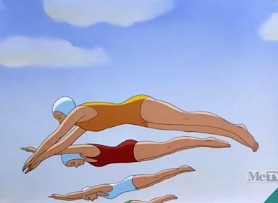
Part of that juxtaposition is sourced from rotoscoping the animation. Tracing live action reference footage gives the animation a stolidity that can prove very beneficial to a purposefully straight laced tone, matching the condescension of the narrator. Build to a climax that then pulls the rug out from the audience through a subversion. That in itself is fine, and the rotoscoping remains relatively solid and coherent (which is not always the case.) Regardless, such a heavy reliance on the technique for such an extended period of time with no warning seems a bit heavy handed. Why Freleng did it is understandable—it just seems like more time could have been spent parsing out the “how”.
Moreover, a fade to black as a transition cuts off the circulation of the sequence. It serves its purpose: a segue from one scene to another, but confuses the viewer as the next scene is an extended idea of the first one. In other words, a cross dissolve should have been inserted where the fade is. Dimming everything to black indicates a finality, a sudden halt, a concrete start and stop that doesn’t serve the directorial needs of the sequence.
Perhaps these feelings are exacerbated through a comparatively underwhelming punchline: the camera cuts out to reveal the prize swimmer’s mermaid build as she saunters away with her trophy. Overzealous clapping by one of the officiants is, ironically, probably the funniest aspect of the gag. Nobody else is clapping—his only auditory partner is the domesticity of Stalling’s resolving music sting. His enthusiasm is regarded to be more enigmatic than the woman who has a mermaid’s fin for legs.
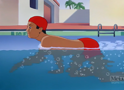
Another odd cut to black that could best be mended by a cross dissolve arrives further animated rotoscoping. Intricacy of the inking and shading is appreciated—the color of the swimmer’s skin adopts a more blue hue for the portions that are submerged, and the decision to keep it lineless communicates a separation between textures and physical states. Animation itself of the swimmer demonstrating all sorts of stroke stylings is serviceable…
…though the effects animation leaves a little to be desired. The water is animated to have a foamy consistency of sorts—obviously to communicate that it’s being broken, disrupted, manipulated. Motivations and intent are clear, but water does not foam up when disrupted by someone swimming through it. It almost appears as though he’s swimming through soap (or, when the suds crowd his mouth, appears as if he has rabies). Shorthand of the bubbles is clever, as meticulously inking each bubble or ripple one by one would be expensive and monotonous. A dissonance is nevertheless noticeable through the solidity of the animation and the comparative crudeness of the effects.
Our swimmer demonstrating a crawl is more indicative of the sorts of effects animation required by the scene.
Similarly, a ripple glass filter is applied to an establishing shot of the swimming pool. Such gives the water a tangible, realistic texture that seeks to elevate the visuals and match them to the ornate human designs. A nice consideration. However, this too is a bit of a stretch; the ripple glass effect works best on natural bodies of water that are always moving or more easily impacted by forces such as wind. Unless manipulated by said forces, pool water is stagnant—thus, a slight dissonance occurs here, too.
This is all neurotic nitpicking. Obviously the quality of the cartoon doesn’t hinge on Freleng or the animators accounting too heavily for the details and perhaps losing oversight of the bigger picture—audiences in 1941 likewise probably weren’t thinking about these elements while watching. Such critiques are mentioned only to try and get into the mindset of Freleng’s crew, attempting to identify and perhaps even justify why certain creative decisions were made or survive as they do. To genuinely get a thorn in one’s side about the water looking too foamy or moving when it’s not supposed to is redundant at best and foolish at worst. Just mere food for thought. Especially given that this short hasn’t established itself as one of Freleng’s most engaging otherwise.
Now, the audience is privy to various stylings of dives. Jackknife, swan… the novelty of the rotoscoping has certainly extended its welcome, but the handling is serviceable and controlled. Proper rotoscope is deceptively difficult to get a handle on, so kudos to the Freleng unit for not having it appear as directionless or formless as it can have a tendency to feel.
“And here is another very popular dive…”
Given that it was Freleng who originated the “EAT AT JOE’S” gag (at least in the Warner run of filmography), he has every right to embrace the groan inducer encouraged here. The self awareness regarding its cheesiness is funnier in itself than some of the gags shown before actually straining to be amusing.
Rowing serves as the final connection to this barrage of aquatically minded gags. Slowly, we begin to divorce ourself of this theme and approach other territories—finishing the segment out on a tangentially related sequence allows the flow of the cartoon to read more coherently and smoothly.
“Notice their perfect precision,” muses Kilpatrick. A consciously tight camera registry clues spot gag veterans such as ourselves to the impending punchline…
Nothing we haven’t seen before, but politely amusing nonetheless. Freleng makes the gag count through its details—one participant rows frantically with a canoe oar, indicating a very guided disjuncture. Lapses in rhythm and synchronization are natural, innate, human nature. One has to go out of their way to deliberately bring the wrong type of oar. Stalling’s accompaniment of “Frat” likewise adopts a more frantic, somewhat discordant rhythm that mimics and personifies the incongruities very well.
Next up: bicycle racing. Whereas a few—or many, depending on one’s personal perception of this short—of the gags featured have been monotonous by accident, Freleng capitalizes on the tedium by transforming it into a punchline.
Cyclists loop around the track over and over and over again, never demonstrating any sort of break in momentum. Musical arrangements are mirror the circuitousness by looping in an equally repetitive vamp. Viewers begin to wise up to the manufactured mundanity… but just as they expect for the pattern to be broken, it keeps going. And going. And going.
Finally, a concession is delivered around 15 seconds and 6 full circuits later: “Monotonous, isn’t it?”
Slave to drudgery, the cyclists resume their tour. Monotony is again the name of the game, but the transition time between the punchline to the next sequence could stand to be cut by a lap and a half. Two more laps aren’t exactly necessary to follow; granted, that in itself only justifies the joke all the more.
Freleng rewards the patience of the audience through visiting recreations more popularly swarmed by the public. And what is more popular than America’s favorite pastime?
Don’t get too excited. The baseball but is another redress of a bit Freleng has reused thrice now, and would continue to do so in later years: a chatterbox catcher. Reused ideas and motifs in the animation are freshened through the novelty of human designs, and dubbing the catcher as “Gabby Hairnet” (a nod to Gabby “Old Tomato Face” Hartnett) attempts to bring something more to the scene than the same recycled fare.
At this point, there isn’t much to comment on the gag. Audiences in 1941 probably wouldn’t have recognized the reuse from Porky’s Baseball Broadcast and Boulevardier from the Bronx. Animation is serviceable, Blanc’s deliveries are convincingly excitable. To unsuspecting audiences, it’s fine, and it fits within the context of the cartoon—just somewhat frustrating knowing that Freleng and Maltese were both capable of much funnier.
Similar gripes will apply to this extended football highlight as well. However, dissecting the façade of the stadium takes precedence. Freleng’s background artist—Paul Julian would have been in his unit by the time this short was released, but the visuals here are likely the handiwork of Lenard Kester—encourages a tip of the hat to fellow cartoon connoisseur Tex Avery.
Deeming the studio in his memoriam serves as a throwaway detail that has ripened with irony and age; Avery likely remained at the studio during this short’s production, but the “memorial” aspect takes on a whole different meaning given his very recent suspension/departure upon the short’s release.
Usage of his name almost seems like a concession of sorts: of the four ideas/gags total touted within that isolated segment, two of them are directly reused (including redrawing the animation) from an Avery short, and one being heavily derivative of a narrator led sequence touted in spot gag shorts such as Believe it or Else. Though not likely to be the intent, plastering his name on the stadium almost feels like a bargain, a deal, a stipend for being able to reuse his ideas. (As if it really worked that way.)
The first gag of the segment is unique to this short: Kilpatrick’s announcement of “…where every seat is on the 50 yard line!” receives a literal visual transcription. Tall, exaggerated perspective encourages dimension and depth, allowing the gag to resonate more than if the staging were completely flat. Ditto for being able to see both sides of the stadium; this peculiar seating arrangement isn’t reserved for one side only.
Enter the Avery cribbage. Players hopping around the field like grasshoppers and a dogpile of action are both reused from the much more confident and competent Screwball Football.
Keen eyes will note that the reuse on the pileup is an especially noticeable giveaway, as the players are drawn with amorphous dog noses and muzzles. Such is the caveat of poorly masked reupholstering. Granted, the composition is purposefully busy and clustered; there is a certain trust placed in the viewer not to be eying the facial construction of the obscured ball players.
If there is a benefit to be had, it’s that the borrowed punchline (the referee in this case emerging from the pile to hawk a catchphrase à la Mr. Kitzel, courtesy of The Al Pearce Show: “Mmm… could be!”) isn’t as egregiously—or slapdashedly—traced. Our human referee looks, acts, and is decidedly human, divorced a step further of his original canine origins than the remainder of the two teams.
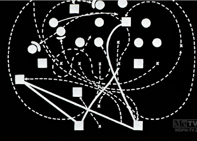
Our last bit of football oriented business shoulders inspiration from Believe it or Else. Courteously, the narrator takes the time to explain the play by means of an animated diagram. There is some humor to be had in the idea of explaining a completely incomprehensible, inexplicable dogpile that was spurred almost instantaneously. Especially given the breathless fervor in which the narrator engages in his lecture, his voice reaching a climax in volume and intensity as the words blend together and the diagrams morph into a proud amalgam of inscrutability.
“And there you are," he heaves with a sigh. A fade to black here actually serves the segment quite well; the finality established by its closure allows the gag to hang in the air, encouraging a dry, sardonic edge. Moreover, the transition from one sequence to another is clear and concise. It’s the little things.
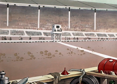
So, with a indubitably heavy heart, we approach our final spotlight of the cartoon’s runtime: auto racing. Ending the cartoon on this note is somewhat abrupt—the ending gag (which will be explored momentarily) is clever and cute and a good a note to end on any, but audiences so inclined to the structure of Avery’s travelogues are almost conditioned to expect a grandiose climax or incontestable subversion for the short to end on. Something that decidedly marks the end. The gag of choice here could just as feasibly have been rearranged to be in any other part of the short—its comedic and directorial impact would remain the same.
Perhaps that likewise is sourced from the generally anticlimactic staging and delivery of its opener. Kilpatrick’s narration is the only thing possessing a palpable sense of energy and conviction, introducing the audience to the raging excitement of the Indy 500. Cars are spaced far apart from one another—obviously such is the nature of a race, not every car will come in at the same time—which accidentally encourages some dead air and fragmented momentum in waiting for them to come by. A very leisurely climax.
Moreover, stagnant staging could possibly stand to be rejuvenated. Cutting to a few shots of the cars actually on the track, whether overhead or head-on, would do wonders in alleviating the monotony. Even if that’s merely a band-aid or the illusion of alleviating the monotony. Instead, the only palpable source of interest in the highlight stems from a gag with a “midget car”—Blanc’s high, nasal, flatulent sounding engine arouses a laugh, especially after the tedium of hearing (and seeing) engines that are much bigger and louder. Spike Jones’ “Dance of the Hours” would feature a similar gag.
“And now here comes the winner across the finish line!” Audiences are encouraged to suspend their disbelief and ignore that our winner is actually the one who comes in last. Even if it's intended to read as the other racers just starting the last lap, a disconnect nevertheless persists.
His entrance does herald one of the short’s more inspired means of transitioning—clouds of dust completely envelop the camera, offering a buffer to jump into the next scene. The transformation isn’t as complete as it could be, as the camera merely engages in a jump cut (as opposed to the dust dissolving and gradually heralding the next scene), but, again: it’s the thought that counts.
Especially given that the visual of the prize racer takes much more precedence. Covering the car with rendered brush strokes to simulate his near incomprehensible levels of speed is one thing; extending this to the racer himself is another.
“Won’t you say a few words?”
Ever charitable, the victor sheds his engaging wisdom: the sound of an engine revving coming out of his mouth. There probably could stand to be a more concrete topper of some kind, but it’s as good a note to end on as any for this cartoon. Iris out.
To deem Sport Chumpions as one of Freleng’s most inspired or dedicated pieces of filmmaking would be misleading. Misleading, in that it’s an outright lie. For the senior director of the studio (brief stint at MGM notwithstanding), he’s had very few outright duds, all things considered. Especially regarding his post-MGM work. Even this short has its share of retribution through inspired bursts: the title cards are cute and novel, the ping pong eyeball gag memorable, a comparatively firm handling on rotoscope when necessary, and so on. Labeling it entirely worthless is just as misleading as labeling it particularly good.
Such is the rub of these spot gag cartoons. As has been expressed time and time again, the convenience of modern technology has certainly exacerbated any fatigue in viewing them. They weren’t intended to be viewed back to back to back. Likewise, audiences of 80 years ago were likely able to appreciate the format and novelty of the cartoons more due to their frequent familiarity of the source material. Like every other one of these shorts, they can’t be written off because they’re old hat or boring or whatever else have you.
Still, if anything, this short allows modern viewers to appreciate Tex Avery’s architecture of the format all the more. They may be repetitive, but they often worked. In watching Sport Chumpions, the impulse to compare to Avery—perhaps unfairly—is difficult to silence. The short doesn’t end with a giant, melodramatic climax. Avery would have executed this gag differently. This isn’t how these sorts of gags are usually paced. It becomes all too easy to take Avery’s spot gags for granted until a proper means of comparison comes along.Granted, this isn’t meant to drag Freleng’s name through the mud. This isn’t his finest hour, but it’s obviously not a short he felt pressured to dedicate a ton of time, pressure, and love into. Likewise, it’s his first outing at the fragmented spot gag format to begin with. One could argue She Was an Acrobat’s Daughter was the first—and there is certainly truth in that statement. Fragments of gags all strung together in one overarching sequence. However, that short was more unique to Freleng’s own interpretation and tastes. This short is very clearly following in the mold of Avery’s travelogues, which was the mold. Of course there will be some bumps in attempting to mimic another director’s style, much less do it for the first time.
The problem isn’t that this short needs to be more like a Tex Avery cartoon. It’s that it needs to be more like a Friz Freleng cartoon. Usual landmarks of what make his shorts so unique and funny are largely absent here. No elaborate musical or behavioral timing, no subliminal, dry commentary. No philosophy of “less is more”. This isn’t a short that embraces Freleng’s directorial strengths—some of that may stem from the pressure of attempting to adapt Avery’s format. Some of that may stem from a general lack of interest with the cartoon. Who’s to say.
At the end of the day, it doesn’t matter. Freleng’s notoriety as a filmmaker doesn’t hinge on the success or failure of a throwaway quota-filler from 1941. This short is harmless, as are any of the directorial shortcomings or missteps mentioned above. It serves its purpose in occupying seven minutes before a movie and coercing a few polite smiles out of the audience. That in itself is as noble a cause as any.







.gif)








.gif)






No comments:
Post a Comment