Release Date: March 29th, 1941
Series: Merrie Melodies
Director: Bob Clampett
Story: Tubby Millar
Animation: Vive Risto
Musical Direction: Carl Stalling
Starring: Mel Blanc (Pie, Barker, Tongues, Gorilla, Log Cabin child, “Buck Bunny rides again!”, Horse Radish, Superguy, Rochester), Sara Berner (Brenda, Cobina, Baby Superguy, Henry’s Mother), Kent Rogers (Henry Aldrich, Ned Sparks), Jack Lescoulie (Jack Bunny), The Sportsmen Quartet (Chorus), Georgia Stark (Whistle)

(You may view the cartoon here!)
For the first time since his unit began in 1937, Bob Clampett has the honor of directing a cartoon in color. While he would inherit Tex Avery’s unit later that year (which meant, in his eyes, access to the best animators in the studio), this and his next color cartoon, Farm Frolics, were constructed with the animators of his regular black and white unit.
At first glance, it may not seem like a big deal—everyone gets to direct color cartoons at some point, right? Friz Freleng started off with black and white cartoons. Tex Avery started off with black and white cartoons. Surely it’s a natural progression in the realm of cartooning. Well, not exactly—just ask Norm McCabe, who inherited Clampett’s black and white unit upon his inheritance of the Avery unit; McCabe never got the opportunity to direct a cartoon in color.
It’s not to imply that cartoons aren’t worthwhile if they aren’t in color. Quite the opposite. Yet, for Clampett, who had been delegated to the same contract for 4 years that stipulated he could only direct black and white Porky cartoons, this change had to have been a great relief; the consequences of his directorial restrictions have been becoming more apparent within the past few years, growing more uninspired and burnt out. Thus, this is a very reassuring sign of cartoons to come.
Goofy Groceries isn’t a mecca of Clampett’s artistry, of course—expecting his first color cartoon to be an absolute masterpiece would be a bit hasty. Still, the newfound access to higher budgets and the production value within are evident. As the title implies, it’s another “___ come to life” cartoon that was so rife in the ‘30s. It’s one of three that Clampett would direct—yet, unlike many of the others that preceded this one, there comes a bit more gravity knowing that Clampett was the one who originated the genre in the first place. Says Clampett in his own words:
“The first week I was at the studio, a meeting of the entire staff was called to shore up the story for Merrie Melodie No. 2.” The cartoon in question was Smile, Darn Ya, Smile!, released in 1931.

“It revolved around a streetcar, and they needed a fresh and novel way to gag up the usual singing chorus. Nothing much came out of the meeting, but riding home on the streetcar, I hit on an idea. I submitted a sequence in which the streetcar's advertising cards—the Smith Brothers, Dutch Cleanser girl, and other famous trademark figures—came to life and satirized the song. My idea was used, and made a tremendous hit in the theaters. A critic called it the first original Warner Bros. cartoon formula, as distinguished from Disney. We followed it with magazine covers, grocery store labels, and on and on. After that, Hugh [Harman] kept calling me in from animation for story meetings, and encouraged me to turn in ideas.”
Now, he has the opportunity to follow in his own footsteps. Like many of the “come to life” cartoons, the short itself is relatively simple—grocery labels and items come to life to sing, dance and perform, but their activities are soon terminated through the threat of a ravaging ape.
Whereas many of the “come to life” cartoons begin with an establishing shot of a building’s façade or a shelf where the soon-to-be anthropomorphized subjects lie, Clampett opens by looking out from within. Positioning the camera inside the dark store, gazing out the window and viewing the soft snow falling on the streets instills a coziness and feeling of security. A docile atmosphere ripe to be shaken by vaudevillian grocery items.

Indeed, a woman’s voice singing “If I Could Be with You” is cued once the camera trucks out and begins to maneuver around the interior of the store, indicating a sentient presence within. Already, the elevated production values are visible through the variance of color in the backgrounds and the objects in the foreground. A cash register and a bottle move at a different interval than the background, and the bottle moves at a faster interval than the register—it’s not as though these maneuvers couldn’t have been achieved in black and white, but it is certainly a different twist on Clampett’s usual overlaid pans.


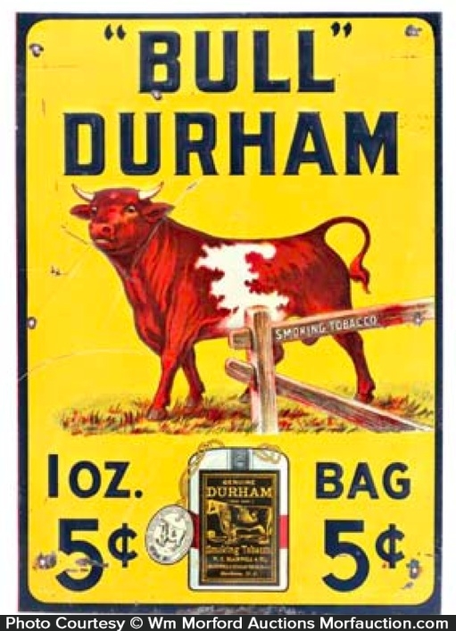
The culprit is revealed to be a cow, crooning to her love on a can of “Fulla Bull” tobacco—very much in line with Clampett’s sense of humor, in both wordplay and its implied crassness. Audiences in 1941 would have immediately recognized it as a play on Bull Durham tobacco. “Contented milk”, meanwhile, is less obtuse but still would have been identifiable; it serves as a jab to Carnation Evaporated Milk, whose advertising campaign proudly boasted the slogan “from contented cows”.


Animation of the two characters is relatively modest, being that the slogans and wordplay are the main priority. Still, the cow singer moves in solid perspective and grace, and the promiscuous implications of the bull’s eyebrow waggles are a nice topper to its already censor-pushing tobacco label. A brief cel layer occurs on the bull’s markings as the camera pans left, with some of his black spots missing, but is quick to be corrected and doesn’t detract from any of the action on screen.


Discontented milk is the answer to the earlier contented milk, stemming from the same parent of source material. Ironically, given how comparatively pedestrian the action is on screen next to what will later unfold with the climax, animation of the two cows conversing are some of the funniest and most energetic drawings in the picture. Historian Mark Kausler speculates it to be the handiwork of Norm McCabe, which tracks with the prominent double eyebrows. Given the solid perspective and general elasticity in the drawings, it could easily be conflated for the work of John Carey—however, the features on the face seem to be approached and move with a different sense of timing than what was characteristic of his work.


Sara Berner provides the voices of both Brenda and Cobina (branded as Linda and Kerdina), who were popular characters on Bobe Hope’s radio show. They, in turn, were parodies of notorious socialites Brenda Frazier and Cobina Wright, Jr. Blanche Stewart provided the voice of Brenda, whereas Elvia Allman—who, regular readers may recognize her name as popping up in many of the Tex Avery’s Merrie Melodies in the mid-to-late ‘30s—performed as Cobina.
Here, Berner’s impression of Allman is spot on. So much so that Clampett would later use her to perform that same impression in his Eatin’ on the Cuff/The Moth Who Came to Supper, playing the role as an antagonistic, lovelorn black widow who has her sights set on the eponymous moth. She echoes the same catchphrase there as she does in this instance to Brenda: “Look, a man!”

Again, the artistry of McCabe’s drawings cannot be understated. They’re full of life, full of humor, yet don’t seem unnecessarily extravagant or ill-fitting in their motivations. Mannerisms of both cows support their respective vocal deliveries; Cobina, for example, whose voice is louder and more crass boats broader gestures and wilder facial expressions, whereas the pitched coyness of Brenda’s deliveries are perfectly matched with her equally disingenuous eyelash flutters. Likewise, how the drawings move themselves remains functional, visually appealing, and motivated. It is truly lamentable how brisk their screen-time is.


A cut is made back to the lovebird bovines, captured within a heart iris. The shot doesn’t have much of a functional purpose, its insertion reading as somewhat random between the flow of shots, but it doesn’t try to have a purpose other than serve as a creative footnote. It’s an affectionately kitschy aside that exists purely because it can.

Dissolving to a caricature of Ned Sparks may seem just as random, but does fit given the pop culture references just moments before and with Clampett’s adoration of said references. Here, the caricature is heavily referenced (that is, traced and slightly modified) from Tex Avery’s Fresh Fish—even an extension on budgets and time won’t impede his affliction for reuse.


However, this recycled caricature isn’t as much of a throwaway as one would think. Sparks’ monotone growl of “This love stuff makes me sick!” happens to be the first vocal delivery uttered by one Kent Rogers in a Warner cartoon.

Even then, his talent didn’t start and end exclusively with Warner Bros. Other cartoon studios boating his vocal talents were MGM, Walter Lantz, and Columbia Screen Gems. Likewise, he could be heard on radio, dubbing live action for Paramount’s Speaking of Animals shorts, and seen in a few live action roles, such as the role of Henry, ever fittingly an impressionist in the film All-American Co-ed. He was an incredible talent whose presence in these films made them all the more rich, funny, and authentic so that every single voice role wasn’t just dominated by Mel Blanc. Such an early death is truly tragic in many, many ways—if he could have such a wealth of roles at such a young age, who knew what he could accomplish if he had more time to flex his talents.
In any case, time (and cartoons) march on. The next few gags are somewhat aimlessly inserted—as tends to be the trend with these cartoons—and not intrinsically tied to any sort of background action occurring. For example, a chicken pot pie clucks like a chicken, and a rabbit caricature of Jack Benny (voiced once more by Benny impersonator extraordinaire, Jack Lescoulie) introduces himself as—you guessed it—Jack Bunny. His introduction does hold some merit, as we will be revisiting him later, but this is certainly one of the “in between” portions of the cartoons that seeks to establish any leftover gags between song numbers. They end up feeling somewhat awkward and insecure as a result, with no place to thrive in the sequence of events, but that’s much more a critique of the format as a whole rather than a directorial failing.


Benny Bunny attempts to rectify that by cueing his maestro, whose musical stylings dictate the direction of the next segment. A pause lingers between his introduction and his acknowledgement of the maestro for an uncomfortably long time, but remains relatively harmless.

Right away, the audience immediately knows that the dish mop propped up against its box is immediately going to morph into a caricature of Leopold Stokowski. Using a sign marking down the prices as a music stand is a very clever subversion that is much more simple, yet fitting, and the availability of the spotlight and instruments warming up is endearingly amusing. Everything falls into place instantly; this isn’t the first time they’ve run through such a routine.


Stokowski’s arrangement of choice is “It Looks Like a Big Night Tonight”—a far cry from the usual sophistication he was associated with, hence being the joke. It moreover launches the cartoon into a circus atmosphere that guides much of the remaining songs and dances, hosted by a barker who—of course—is a dog. Attempts to meld the theme into various grocery items are polite and amusing, whether it be the animated façade of “Big Top Popcorn” or cigarettes operating as calliopes.


Repeating the same shot of the animated crowd heading into the big top on the popcorn label, the camera trucks in ever so slightly to simulate the audience being plunged into the circus. It instead reads somewhat oddly, slightly disjointed as the camera barely moves and trucks back upon the cross dissolve to the barker dog. It seems like movement and visual noise for the sake of movement and visual noise, though there very much is an underlying intention.

John Carey’s animation of the dog once he indulges in his anthropomorphism is a delight. Perspective is solid not only in his features and construction, but the direction in which he gestures and flails; the cane waving to and fro in front of the camera gives the field a real sense of depth and dimension that brings an authenticity to a decidedly inauthentic scenario. (A side note, one of the ingredients in the dog food—as indicated on the side—seems to be poison.)


A dramatic perspective shot of the dog hawking to the audience boasts some particularly tactile animation—the dog shivering, quivering and wriggling, as indicated through his monologue, both feel like distinct and independent actions from each other; a sign of a skilled animator who is able to differentiate those little nuances. Unfortunately, the shot is somewhat marred through a jump cut back to the wide shot, making the sequence feel abrasive and discombobulated in its flow. Again, in the grand scheme of things it’s a very minor nitpick, but the dog introducing his act could easily have been executed on that same upward shot. Going back to the original layout just for one single sentence seems unnecessary.
.gif)

Mainly, it serves to provide an easier jumping off point for his act—the camera pan right is much easier when both characters are on the same plane.

“Wiggly Gum” is, of course, a take off of Wrigley brand gum. Said gum is a belly dancer to live up to her namesake; the wordplay seems to be a bigger priority than the actual animation itself, which is modest. The dog branding her as “Little Egypt” refers to a title that grew to be synonymous with belly dancers, seeing as so many dancers went by that title.

More Carey animation (with parts of it appearing to be reused and mirrored, with only the lip sync altered to match the new line reads) serves as a bridge into the next act: a medley of “By a Waterfall” and “All This and Heaven Too”, introduced under the guise of Billy Posie’s Aquackade. Glittering effects on the gold typography that gilds a giant, red curtain appears to be another manner of Technicolor indulgence from Clampett. As it should be, given the circumstances.


This, too, is a nod to then current pop culture; Billy Rose’s Aquacade was deemed the most successful production of the 1939 New York World’s Fair. It traveled around the country, from its origins of the Great Lakes Exposition in Cleveland to a stint at San Francisco’s Golden Gate International Exposition in 1940. It predictably attracted a number of high profile names, including Olympian turned famed Tarzan actor Johnny Weissmuller to swimming legend and actress Esther Williams.


The source of the Aquacade stems from a box of shredded wheat, whose waterfall supplements the coming antics. A few layers dominate this seemingly innocuous shot of the wheat; it mainly serves as a riff on Nabisco’s shredded wheat boxes, whose slogan of “The Original Niagara Falls Product” often found its box art coupled with the aforementioned waterfalls. However, its name in the cartoon here is a bit of a stretch—“U-Know Biscuits” tips its hat to Uneeda Biscuit, which was also a product of Nabisco.
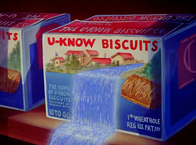
And, if one wanted to dig further, the visual in and of itself takes inspiration from the same gag in 1934’s How Do I Know It’s Sunday—also a “come to life” cartoon focusing heavily on grocery items. To view the growth in art direction within the past 7 years is a rather humbling experience, Technicolor or not. Same with the extravagance of the chorus for “By a Waterfall”, which is, likewise, the musical accompaniment in the aforementioned scene.

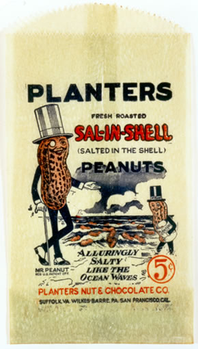
Whereas the pan following the waterfall led to the Morton Salt girl in Sunday, our “pan” here—a truck-in of the waterfall animation and a dissolve to its basin—ushers in a new barrage of anthropomorphic grocery labels frolicking in a sink. Whereas the Gold Dust washing powder twins (warning for blackface imagery in the link) are recognizable from the egregiousness of their caricatures, Planters’ Mr. Peanut also catches the eye through his having stood the test of time. (The Gold Dust twins, shocking as it may seem, have not.)


Introducing a can of sardines prompts the Aquacade similarities to solidify—said sardines are voluptuous caricatures of female swimming beauties. They again seem to exist solely for the purpose of appealing to Clampett’s indulgences, enthusiastically flaunting his new budgets and production values through swarms of mirrored, synchronized animation on layers upon layers of moving cels.


Simple as the premise may be, this is definitely some of the most extravagant animation within the Clampett unit yet for sheer volume alone. If not extravagant, then certainly the most busy—yet choreographed in a manner that doesn’t overwhelm the senses or border on incoherence. They thrive particularly well against the layered, ethereal chorus off screen. It very much does feel like a genuine production in that moment rather than an directionless tangent of musical synchronization.


Dissolving back to Carey’s animation of the barker dog yields more elastic, appealing and lively drawings that juxtapose nicely with the grace and showiness of the aforementioned sardines. His next act isn’t as rooted in grace (seeing as part of their act includes flipping their skirts up, which the camera momentarily trucks in on) as the previous show, but still falls into that same category of impressiveness through synchronicity and production values.


Mention of a “tomato can-can dance” prepares the audience to expect the obvious: anthropomorphic tomato cans dancing the can-can. That much is indeed true. However, rather than performing to its accompanying tune from Jacques Offenbach’s Orpheus in the Underworld, they indulge in a more contemporary number: “I’m Just Wild About Harry”.


For all of the things in the world that could be said regarding dancing tomato cans, the sequence is very well handled. There isn’t much to say on it, other than it’s lithe, peppy, and satisfying to watch with how it synchronizes with the beat. Extraneousness on having to animate and ink the ruffles on and within their skirts is certainly not lost—it’s handled very well with no flashing or other inconsistencies that tend to bar these sorts of details.


Tongue sandwiches join in on the chorus with predictable results; basic of a visual as it may be, it remains endearingly amusing through its mischief and lightheartedness. It fits within Clampett’s comic sensibilities well.

While there’s no documentation that he did so, it wouldn’t be surprised if he was responsible for the gag’s origin. Given what he said about occasionally pitching gags to various cartoons (as was the case in Smile, Darn Ya, Smile!), it doesn’t seem completely asinine to suggest he did the same for Buddy’s Beer Garden in 1933. Either way, prior involvement or not, it remains that the gag had existed once before and manages to meld itself well into Clampett’s directorial tone.

A series of camera moves away from the showcase indicates a shift in tone and priorities. Sure enough, following a brief bit of aimless fidgeting with the camera (moving diagonally up, trucking in very slowly and insubstantially before melting to a dissolve and continuously panning up), crawling to the top of the layout heralds the second act of the short: the obligatory antagonist.


He is stored on the very top shelf of the grocery store, dust and cobwebs indicating his product has been abandoned for some time. Texture of the cobwebs in the foreground feel rather realistic, tactile in their stringy dustiness. Likewise, having the chorus and musical arrangement creep to a whisper as the camera continues to move is an effective way to indicate how high up this abandoned villain is, completely out of earshot from the festivities.


Moreover, it bestows Stalling with the opportunity to shift to an ominous, sinister drone foreshadowing the villain’s nefariousness. Within the depths of a cheerily decorated animal crackers box lies a snarling, rampaging gorilla whose snorts and growls can be heard before he even tears the box apart.


Rather than causing a rampage just for the sake of causing a rampage, Clampett and writer Tubby Millar attempt to create some form of build up as a justification. Not much, but enough to pad out the momentum and implement a driving force that keeps the short coherent. It’s the King Kong approach, which, given Clampett’s affinity of pop culture, is certainly purposeful—the gorilla has his eye on the ladies.

How this is portrayed is simple, but memorable in its creative liberty; animation of the can-can dancers, the belly dancing gum, and the slender sardines are shot on a double exposure to communicate that all of these images are flashing before his eyes. Much more to the point than cutting to the same scenes we’ve seen before indicating the same thing. Each act that dissolves before his eyes has its own music cue that was associated with the act (“I’m Just Wild About Harry” for the cans, “All This and Heaven Too” for the sardines, and so on) to moreover jog the audience’s memory and give those acts a permanence through recognizability in music.


Quite literally, too; following a shot of the grocery items screaming in terror, pseudo-King Kong hops onto a hanging lamp to begin his descent. Animation of him swinging to and fro in perspective is remarkably tactile, whether it be from the solidity in the ape’s construction or the believability of his mass weighing down the lamp and creating a wide swinging motion. Shadows on his fur to indicate the rim lighting of the lamp prove helpful in further chiseling out his construction and conveying dimension.


Additionally, swinging on the light offers more artistic possibilities, such as submerging the store in darkness as the light turns off beneath his weight. Implementing a sound to indicate the light shutting off wouldn’t have hurt in making the action more readable and seamless; in the animation itself, he seems to jump between poses when in the light versus in the dark, creating a stronger jolt than intended. The main idea is nevertheless communicated—it was once light, and now it’s not, and we saw how that happens. Animation of the gorilla’s silhouette doesn’t need to be as sculpted as how he appears in the light.


Glowing scleras race past each other in the only blackness. It’s another cheat on the economic side—certainly much less laborious than demonstrating all of the characters running into each other with new color palettes to accentuate the added darkness—but one that is sensible and certainly doesn’t feel “cheap” on the surface level. Having the eyes race in varying perspectives, including a Mel Blanc scream subject to the doppler effect as that voice races into the foreground, likewise rendering such a sparse layout more rich and dimensional.


Such is nevertheless temporary, a way for Clampett to indulge in the new opportunities color cartoons and wider budgets give him. The ape turns on the lamp once more by accident, before lunging towards the camera with fangs wide open. It doesn’t feel like he’s jumping so much as he is floating aimlessly—there’s a certain weightlessness to the animation that makes it somewhat difficult to pinpoint what exactly is happening. Then again, such is partly a side effect of the fast paced chaos unraveling on screen. Coherence takes a bit of a backseat compared to adrenaline and excitement.


Log Cabin Syrup is appropriated as “Log Cabin Soup”, immediately recognizable from its cabin shaped tin. September in the Rain, yet another sentient grocery cartoon, referenced the same.

Here, it exists as a backdrop for one of the Gold Dust twins to hide in. Predictably, it offers a chance for Mel Blanc to perform a dialect for the 2 seconds the kid is on screen—have to make those caricatures count somehow. He darts into the house, where a sign declaring a quarantine against measles seeks to offer protection.


Clampett would again reprise the gag to greater effect (and absurdity) in Eatin’ on the Cuff the following year.

Cutting back to the ape’s disembodied hand groping at one of the tomato cans feels sudden and jarring, perhaps more than desired—yet, as mentioned before, these feelings of alarm and abrasion are sought out for. Drawings of the hand are chiseled, detailed, creating a strong juxtaposition against the more smooth and less gangly nature of the tomato can. Thus, the hand feels more like a threat through such definition and contrast.


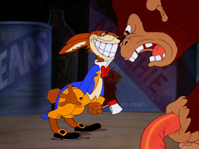
And who else is it who jumps into save the day than Jack Bunny. Hopping onto a jar of horse radish prompts the jar to morph into a galloping horse, which, in turn, opens an avenue for additional pop culture references. Bunny’s manly declaration of “BUCK BUNNY RIDES AGAIN!” isn’t an aimless quip, but a nod to Jack Benny’s alter ego of Buck Benny on his radio show, associated with that same tagline. This hasn’t been the first Buck Benny reference in these cartoons, nor would it be the last—the cartoon title Bugs Bunny Rides Again serves as yet another homage.


Meanwhile, a fleet of Navy (with a capital N) beans opt to join in the fight as well. Their cycle as they rush onto the screen feels somewhat choppy and stilted in comparison to other bits of animation seen thus far, but, in a way, seems to accentuate the sheer volume of “soldiers” available. Enough to seem as though they’re melding together in the audience’s eyes. Again, the concentration of characters and animation is not lost on the viewer—there are so many beans because now there can be this many. That fleet would have been a third of the size and shot at a closer angle to inflate their presence if this were a black and white cartoon.

Ditto for a fleet of turtles turned army tanks; one turtle on an establishing close-up is suddenly transformed into five in the next cut, implying that there were multiple cans of turtle soup who engaged in the same sort of preparation. A brief cel layer is noticeable at the very start of the close-up, with the turtle popping out of his shell being the first cel shot. Again, very small and barely noticeable to the eye, but intriguing to note in thinking about the human touch that dictates these cartoons.


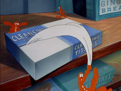
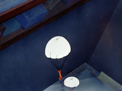
Elsewhere, gingerbread men use tissues as parachutes to join the growing military. Diagonal angles of the cookies jumping communicate height, depth, and a sense of action through the dynamism innate in unconventional angles.
Cigarettes transforming corncob pipes into their own tanks receive similar praises of theatrics; the transformative aspects are creative, fitting with the conflict, the all black backdrop is bold and dynamic, and the constant flow of motion keeps the audience stimulated and the action flowing. It’s again worth reiterating that all of this wouldn’t be impossible in black and white, but the extra breathing room offered by a slightly roomier budget makes a difference with indulging in such theatrics. Had this been a black and white Looney Tune, one gets the sense that recycled animation and other reuse would have been a heavier crutch. This isn’t completely groundbreaking territory for Clampett, but it’s refreshing to see those indulgences on display. If you can do it, do it.


Such seems to be a motto adopted by Clampett as the ape retaliates through means of fireworks. Why fireworks? They’re colorful and explosive, offering an opportunity to flaunt some FX animation in shiny, Technicolor bursts. Even the mere act of grabbing a dynamite stick is comparatively extravagant, the explosive sweeping in perspective across the foreground; ditto with the match creating a flaming arc as it’s lit. It’s likely that this action would have been much more obligatory and brisk had the short been a black and white Looney Tune.


Fireworks, in addition to contributing some additional visual grandeur, provide a way to disarm Bunny off of his steed and propel him in front of a box of chocolate covered cherries. Inconvenient as that may be, the axe on the box (representative, of course, of the fable involving George Washington and the cherry tree) offers a new means of attack against the ape.


Said attack encourages two means of indulgence from Clampett: firstly, visual indulgence of a chick themed cheering section encouraging Bunny to give the ape the “ax-ax-ax!”; the chicks are mirrored in their subsequent rows to fill out their makeshift stadium, again falling in line with previous comments about duplicated action to enhance the visual grandiosity and balance. Likewise, fitting into the “just because we can” territory are the multicolored pennants for each row.

A more customary piece of Clampettian indulgence stems from repurposed animation. Here, both the run cycle and gag of Bunny’s axe being reduced to nothingness is referenced from Clampett’s 1939 Chicken Jitters—ironic, given that Jitters itself bears some notorious instances of animation reuse. To audiences in 1941, the reupholstering of animation wouldn’t have been noticeable at all, as it fits well enough into the flow of action. Keen eyes will nevertheless note that Bunny’s construction seems much more soft and squat than his reigning limberness in matching the reference footage of Porky.


Attempts are somewhat made to hide any blatantly in the reuse, such as stretching out the sequence with shots in between. Shots of the chick cheering section for one, or the gorilla noticing his pursuer and firing the rockets that reduce the axe to nothing. The eye take of the ape taking notice is animated particularly well—the drawings and draftsmanship in themselves are not particularly tight or confident, but the sudden pop of his red rimmed eyes is motivated present in its tactility. An antic to keep it bouncy and energy, followed by a nice settle on ones to convey a smoothness that juxtaposes comfortably against the abrasiveness of the pop. In less pedantic terms: it looks good.
.gif)
The sheepish smile that slithers onto Bunny’s face when realizing he’s been cornered seems to take its roots from Porky’s Last Stand. While such a smile take predates that cartoon (such as Chuck Jones’ The Curious Puppy, which, coincidentally, precedes Stand), the graphic stylization of the side profile reads and moves very similarly to the aforementioned example.

Quickly dissolving from Bunny pinned against the “wall” to a caricature of Superman yields a somewhat odd choice for a transition. Given that Bunny’s situation is dire, the tone climactic, using a more gentle segue such as a dissolve seems odd—it conveys a slight leisure through the implication of time passing that is discordant with the intended sense of alarm and excitement.

More pressing matters nevertheless prevail, such as the very real possibility of this Superman being the first animated Superman period. If another studio did somehow beat Clampett to the punch, then it’s at least the first animated Superman for Warner Bros. Goofy Groceries predates the animated Fleischer series by about six months, elevating the possibility of this being first—likewise with Clampett’s love of pop culture, sourcing this cameo as a direct homage to the comics rather than having seen another studio do it first.

His design is affectionately dopey; fitting, given his name of “Superguy” falls into that same territory. Buck teeth, rubbery features, an outwardly chipper disposition rather than the usual barrel chested stoicism.


Following some more frantic run cycles, a tin can slides with great convenience under Superman’s feet to give him a platform.


“Hey, you big ape!” His voice, predictably, is just as dopey as his name and looks.

“YEEEEEAAAAAAH??”

While Superman shrinking into a baby to represent his cowardice is a much stronger visual priority, the detail of the ape turning around in perspective to the camera is appreciated—contributes further dimension to some very conservative staging. Thus, not only is Clampett the first to animate Superman, but the first to openly humiliate him as well.


Granted, even the gorilla doesn’t get very far with his taunting. As he and Bunny both wait in petrified, snarling tension for the fuse to shrink, Sara Berner’s call of “HEEEEEEN-RYYYYY!” can be heard off screen. So much so that the gorilla takes note and heeds pause—note the look of his pupils as he blinks.


The quick, skittish matter of fact-ness in which Henry forks over the explosive is wonderfully timed. Perfectly reminiscent of a kid getting in trouble, forcing the blame onto someone at the last minute, and making a break for it.

“COMING, MOTHER!” His prepubescent voice cracks are again the work of Kent Rogers, who was likely still young enough to relate to Henry being wrangled by his mother.

This, too, is an elaborate reference to radio; The Aldrich Family was still relatively new as of 1941, having started in 1939 and would continue all the way up into the ‘50s. Comic book, television and film adaptations were born from its popularity, as was many a reference in a cartoon. Here, the bit between Henry (the ape) Aldrich and his mother is recited from the radio show’s opening, which is regarded as one of the most iconic radio signatures of its day. Clampett would reprise this same bit in perhaps the greatest “come to life” cartoon of all: Book Revue.


Meanwhile, the Benny Bunny is free to deal with the ramification of the explosive all by himself. John Carey nails both the limberness of his takes as he recognizes the gravity of the firework in his hand and the more understated, affectionately awkward mannerisms associated with Benny’s persona. Drawings move as efficiently as they look, oscillating between a hunched, nervous grin to a wide-eyed take with the utmost of ease.


Of course, Jack Benny’s persona is associated with too much poor luck for his rabbit counterpart to get an even break. Again making the most of the expanded budgets and color pallets, the smoke clouds from the explosion seem to be painted right on the cel; such gives the visual a more discernible texture and flavor, feeling more like an inconvenience through the conveyed ashiness.


Unfortunately, the outcome is the same as almost every explosive outcome in the ‘40s landscape of cartoons. Here, the decision to color the ash as a complete, dark black over ashy gray or brown—not that those are “better” alternatives—just seems additionally reprehensible given the availability of different colors. Egregious, yes, but to act surprised is a bit naïve.


“My oh my! Tattletale gray!” uttered in the vocal stylings of Eddie "Rochester" Anderson was, likewise, the same ending sign-off for Clampett’s Jeepers Creepers just a year and a half before.

Goofy Groceries may not be a particularly stunning cartoon, but it is certainly novel in more ways than one—the number one novelty being Clampett’s newfound access to color.
A cartoon’s quality is not indicative through its color or lack thereof. Black and white shorts open new avenues of creativity and boldness through their limitations that may otherwise be taken for granted in its color counterparts. Likewise, there are certainly many funny, inventive, and entertaining shorts in black and white for every dud in color. It’s not as though Clampett’s career can be summarized as black and white = burnt out, color = genius.
Still, the limited color palette of the cartoons didn’t pose as much of a problem as the restrained budgets, tight schedules, and Porky-exclusive contracts. Clampett finally being able to break out of that comes as a great relief to both him and his viewers alike; he now has more room to experiment and see ideas through that he’s wanted to for a long time. This change too would be gradual, as it wouldn’t really be until the next year or so that his cartoons would receive a significant boost under the acquisition of Avery’s animators. Even then, that this cartoon exists at all is a promising sign of things to come.
As for what’s in the short itself, it’s fine. There are directorial decisions that cause some very slight dissonance—unnecessary camera moves, an odd flow of shots, an unnecessary transition, occasional lapses of consistency—but much of that can be owed to the format of this genre. In a cartoon that seeks to place a random spotlight on different products or characters every few seconds, consistency and coherency is going to be hard to achieve. Likewise, it was Clampett’s first outing with the format in the long-form. This is certainly more coherent and climactic than something like How Do I Know It’s Sunday.
It’s a fun experiment that is better than some of the come to life cartoons, and would be bested by other come to life cartoons (such as Book Revue.) Mainly, the most praise stems from what it’s indicative of; at least from a historical standpoint. It’s indicative of Clampett finally reaching the end of his dry spell, finally having the opportunity to experiment and breathe and truly direct rather than drone along on autopilot. It’s not to say that all of the faults and misses of the past two years come to a stop with this cartoon, but it is very much a solid indicator of better things to come. For that, we are grateful.


No comments:
Post a Comment