Release Date: May 23rd, 1942
Series: Merrie Melodies
Director: Friz Freleng
Story: Dave Monahan
Animation: Gil Turner
Musical Direction: Carl Stalling
Starring: Mel Blanc (Bus Driver, Chinese Men, Announcer, Singer with cold, Clown, Tobacco Auctioneer), Sherry Allen group (Chorus)
(You may view the cartoon here!)


A short that harbors little indications of change within the Warner studio is, ironically, a throwback to some of Friz Freleng’s earliest cartoons. The first to update the lettering on the “Warner Bros. Presents” at the top of the short (keeping this typeface until 1947), and the last short to bear Dave Monaghan’s name until Mexican Joyride—also 1947–is molded in the visage of a structure that seemed to sporadically define the ‘30s cartoon decade for Warners: stuff come to life.
Lights Fantastic (whose name is a take on the phrase “trip the light fantastic”, meaning to dance spryly) is a little bit more novel than its cohorts; instead of every billboard, every sign, every act boasting an anthropomorphic performer of some kind, much of what is presented is purely observational. Frilly light displays seek to impress, to humor, to entertain within their own neon limitations.
Freleng was no stranger to the “come to life” cartoons, especially given that his were some of the earliest by the studio. Even gags that are specific to billboards he has experience with—it wouldn’t entirely be inaccurate to call Fantastic a buffed up response to his own Billboard Frolics. Perhaps the greatest novelty in this short isn’t even necessarily the “anthropomorphism” itself, but how the directing and sense of humor directly juxtaposes against the same sort of premise from 7-8 years before.
Even as early as the opening, the audience is acquainted with the cartoon’s visual grandeur. Transitioning from the cartoon’s title to the credits themselves warrants a camera pan down, which is delivered as a parallax effect: the speed in which the light display moves more quickly than the background itself, which slowly moves up as the light display moves down. The towering scale of the display itself communicates an imposing, larger than life grandeur, whereas the dimensionality of the parallax effect makes the environments feel vast and tangible.
Moreover, there’s even a psychology behind the light displays of the credits. Freleng, being the head honcho of the short, has his name in bolder, comparatively more radiant lights than the others. It isn’t necessarily a purposeful attempt to rob his cohorts of credit or steal his thunder—instead, it just communicates a sense of playful prestige that keeps the composition interesting. All four credits being the same font at the same size would, even unintentionally, uphold a stronger sense of clutter. Varying Freleng’s title size makes it easier to read by capturing the audience’s eye and forcing them to register the information on the screen rather than registering it as a unanimous block of text.
Just as he was credited in Saddle Silly, Dave Monahan bears the moniker of sergeant yet again in this last credit before his war-initiated hiatus. He certainly wasn’t the only one to bear a distinguished credit before heading off into the war; Norm McCabe’s last credit on Tokio Jokio brands him as Corporal. Credits and circumstances unique to their time.
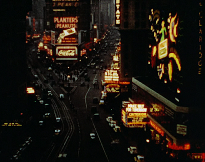
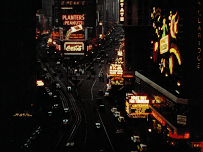
Perhaps a bit ironically, the cartoon doesn't open on any animation, but stock footage. Film of a bustling Times Square is lifted directly from the 1937 film A Star is Born--1944's What's Cookin', Doc? likewise borrows footage from the same film. Its insertion here is unimposing, establishing the tone well and prompting a solid way to segue into the short. Open with the objectivity of a real NYC street scene, then slowly become immersed in a crescendo of animated gags.

It’s an overlaid precision that only Freleng could handle in the way he does—the “Yahoodi Cafe” headline, branded after the popular phrase-turned-song in association with Jerry Colonna, blinks in quick, rapid bursts. That beat and synchronization is sustained as more text is listed below, obedient to both Stalling’s musical beat and the timing of the flashing.


The result is one that is surprisingly organic, natural in its spontaneity, but still commanded under a sense of organization that could only be sewn through a careful source of control. “NO NOTHING” is added in increments for added emphasis, varying the rhythm the audience has inevitably been sucked into. Stalling accompanies each phrase with a particularly bold music sting for confident finality.


Even the lights indicating a hotel in the background serve a purpose. It offers our main attraction an environment to live in, instead of just thrusting the camera on a random sign within a nightly void. Likewise, keeping a conscious eye of the backgrounds offers a smooth transition into the cartoon by bridging together these establishing ideas. Our expositional shot of the streets in Time Square was all buildings, with lights as a decoration. Now, we have about 75% lights and 25% building, easing the viewer in. Slowly, the viewer is acquainted with the atmosphere of the short, giving room to delve into these freeform light gags that don't really have (or need) an excuse to exist.
A necessity especially relevant to the nature of this short is a diverse shot flow. While any and all cartoon benefits from varying its structure, experimenting with rhythm and flow and composition for the benefit of audience intrigue, this is an aspect that is especially crucial to the inherently choppy structure of spot gag cartoons. Flow is hard to come by, and it's an easy compulsion to repeat the same camera angles and layouts. This is especially true for Lights Fantastic, since, in spite of its creativity, there are more limitations in keeping the displays contained to their billboards and attractions. Characters aren't always hopping out of bounds and traveling across the metaphorical stage as they do in other spot gag showcases.
Thus, it is especially important to ensure each shot is distinct from the last. Freleng thereby contrasts the comparatively compact layout of the last scene against a slow, vertical pan down a theatre marquee. Slowness of the camera pan and general tonal grandeur seem to communicate to the audience that this is a big, prestigious affaire, with a classy light display awaiting at the bottom of the marquee.

So, logically, it's instead a throwaway shorts/pants pun that has been lifted from prior shorts such as The Film Fan. From a historian's perspective, the impact is lessened knowing that it's an easily reused punchline, but audiences in 1942 likely weren't consulting their encyclopedia of gags used in prior cartoons. It's fine for what it is.

With the exposition having been fed to the audience, Freleng has a little more freedom to expand the capacity of his gags. Our first substantial light gag is an advertisement for typewriters functioning as a typewriter, sliding just as the role does and each individual letter blinking to life. Those pondering the specificity of "Understood Typewriters" would be right to assume that it is a pun--the Underwood Typewriter Company was the first to produce a modern, widely successful typewriter, even going as far as to create the world's largest typewriter on display in New Jersey's Atlantic City.

By the time the war arrived, it had been scrapped for metal, but its memory nevertheless lives on through this particularly inspired gag. Freleng's musical timing is a key component to the cohesion of the sequence, each phrase being typed to a plucky arrangement of "The Flea Waltz"—each time the “scroll” resets, a gently atonal piano glissando accentuates the action of the billboard sliding back into place. Subtle squash abs stretch physics apply, the distortion offering an anthropomorphism that extends beyond the letters appearing on screen.


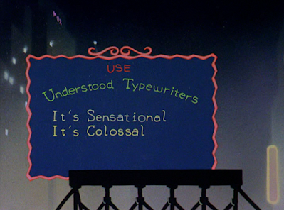
Thus, this repetitious pattern acquaints the audience with the structure of the scene--all the better to directly be refuted by a set of typos. The errors don’t occur spontaneously. Rather, the typing comes to a slow, with Stalling’s piano accompaniment doing the same. Letter typing is fragmented, cautious, almost childishly so…


…which is a stark contrast to the haste in which the words are scratched out. Musical timing is key to the sequence not only to establish rhythm and give the gag the room to breathe and thrive, but to offer a direct parallel to the prior “correct” scenes. Stalling’s musical glissando marking the error is rapid, clunky, hasty, a far cry from the confidence exuded with the previous two lines.
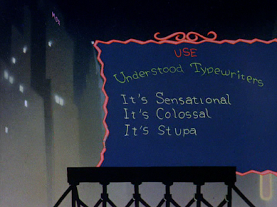

Repeating the error—with the error itself varied for additional authenticity—exudes a commitment to the bit. If he wanted to Freleng could have just tapped out at one typo, banking on the rule of threes for ultimate comedic momentum and immediately defaulting to the resolution. By repeating another error, the sequence feels more realistic, a more genuine struggle to wrack one’s brains on how to spell stupendous. Timing is even varied this second time around, the spelling much more cautious and piano notes clunky with greater immediacy.


A compromise is reached. This, too, isn’t even a complete resumption of normalcy: double exclamation marks connote a colloquiality that coincides with the equally colloquial “swell”. Stalling’s ending piano chord is bold, loud, and somewhat asynchronous, a few notes straying to demonstrate what integrity has been lost through these errors. From the timing to the music, the gag wins out through its sense of observation. There’s a lot to relate to with this his seemingly unimposing billboard.

What is imposing is the unfortunate prevalence of Chinese stereotypes in this cartoon. For the most part, they’re concentrated to this unique cluster of reprehensibility, which is “better” than having sporadic pockets throughout. Audiences aren’t taken off guard by random surprises of deplorableness that would just drag the joke’s corpse through the mud longer than is necessary.
Regardless, the fixation is odd and perhaps especially disarming—in a short branding itself all about light and billboard gags, making rickshaw jokes with no relevance to the hook of the short just makes the stereotypes feel like an even cheaper, lazier attempt to get a laugh than is already the case. Perhaps focusing on this little human footnote was a way to vary the pacing out of fear that the light shtick would get old. Even so, to do so this early on in the cartoon is puzzling at best.


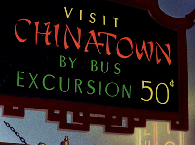
To nitpick further, the sign heralding the gag promises a “Chinatown excursion”. Said excursion amounts to two more throwaway gags, one just being a simple light gag, until the motif is completely abandoned. Obviously, the less deplorable stereotypes, the better, but the fact that these gags aren’t even bound by their promised structure just makes the intentions seem more transparent. Chinatown isn’t a secondary location of the short, connecting to the story; it’s just an excuse for some quick and offensive gags.
Nevertheless, the "quick" aspect is appreciated. Once the rickshaw gimmick is out of the way, the next gag follows a group of men craning their necks to read the vertical text scrolling on a sign. Predictably racist gibberish overlays the action.


And then, Freleng seemingly cuts to a random, unrelated sign gag with no relation to the prior barrage of racism. Here, the gimmick is branded as an eye test--a group of letters come up on the screen in varying font sizes, with a stolidly voiced Blancanese narrator offering appraisal's of the viewer's eyesight for each line. "I.C. Spots" branding is standard, but inoffensive and cute--Carl Stalling builds onto the punnery with an ever fitting musical score of "I Only Have Eyes for You". Presentation is unobtrusive and stoic; it has no reason to be anything else. It's an efficient and easy way for Freleng to maintain a sense of economy by dictating the gag through still images and a voiceover. Always a worthy cause.


Viewers may be left wondering why the short took such a narrative left turn from the Chinese gags. That's because this is all a front for a final topper: the last line of text pops on screen with a piano flourish, with just enough ambiguity to keep the audience guessing. Blanc's narrative tone adopts a chipper timbre, the "If you can read this..." much more anticipatory than the prior entries...

"...you are Chinese."

Stereotypical musical cue ensues. All things considered, speaking in technicalities, the gag functions well in its deceptiveness. Revealing that this stagnant little sight test is related to the prior sequences makes for a novel surprise that keeps the audience invested in the flow of the short. The audience has been tricked into brief continuity. Blanc's matter of fact read of the punchline is nice; the bar is very low, with no visible or audible caricatures being seen as "refreshing", but that thankfully marks the end of this odd fixation on stereotypes from Monahan and Freleng.
Likewise, to compensate for these lows, the short immediately swings into its highlight: a song number from The Sportsman Quartet.Chauncey Olcott's "My Wild Irish Rose" is rebranded into a peppy, modernized jingle of ""My High Polished Nose", obeying to the Four Roses bourbon spoof of "Four Noses". The nose/rose continuum is fitting in itself, with red, shiny noses a beloved cartoon shorthand for drunkenness--such justifying the bulbous proboscises that materialize on each stick figure.


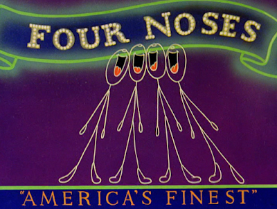


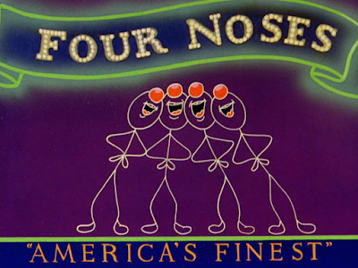
With the exception of the Dinkleheimer cutaway, Manny Perez appears to be responsible for animating the song. Limitations of design regarding the stick figures certainly don't translate to limited creativity, but, rather, enhance it--movements are smooth, rubbery, playful, but still make sense and follow a general structure. There are even attempts to stay loyal to the light motif, with a 5th chorus member (singing in patter song by Blanc himself) blinking on and off the display once he's finished his lines.


While the abstraction of the stick figures is certainly unique to the short's premise, a playful crudeness that Freleng usually wouldn't be able to channel elsewhere (unless if he were to answer Tex Avery's Porky's Preview), the competence of the animation could ironically divorce itself of its intended origins by being so smooth. Light displays are usually a bit more choppy and indicative of their electronic bounds--these adorable, sprightly stick figures, moving in such synchronicity and with such life, do feel like a group of stick men placed on top of a backdrop instead of thriving within said backdrop. Briefly featuring this flickering fifth wheel is a considerate reminder of the short's motif.


It's certainly amusing to compare the lithe designs of the stick men to the unmistakable Freleng humans. The juxtaposition is nevertheless intentional, with the humans dominating static, unelectrified billboards as an antithesis to the flashy light display. Focusing on these fleeting humans not only makes the song more interesting, preventing the audience from finding the stick men monotonous, but it also offers more flexibility for further joke mileage. Lucky Strike cigarettes find themselves with another endorsement from Warner Bros., Blanc "singing" as the tobacco auctioneer heard in the very advertisements that have been immortalized from these cartoons.


Snappy, cute, lively, the song number is an efficient way to kill some time and entertain the audience through novelty and familiar pop culture references. The Sportsmen continue to make every cartoon just a little more rich and interesting with their harmonies. In discussing this short, this segment seems to be the one that is remembered by most. For good reason.


No comments:
Post a Comment